This tutorial is a detailed guide to adding a trendline in Excel to graphs and plots. Previously on QuickExcel, we learned to add and fully customize axes and legends in charts in Microsoft Excel.
You might want to learn to create bar charts, line charts, scatter plots, or other charts in Excel before proceeding with this tutorial.
If you already know how to create these charts, let’s get started!
What are trendlines?
Trendlines on a chart show the trend in the data series. The trendline is usually a curve or line connecting two or more points in a series to show a trend over a while.
There are multiple types of trendlines like linear, exponential, power, and moving average. The moving average is a commonly used type of trendline in data interpretation.
Steps to create a trendline in Excel
The prerequisite to creating a trendline in Excel is to create charts like bar charts and column charts that support trendlines. Here is a sample bar chart to help us learn about trendlines in Excel.
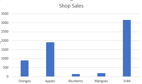
To add a trendline to this chart, follow the steps below.
- Click on the chart.
- Click on the plus icon.
- Check Trendline.
To change the type of the trendline.
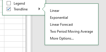
- Click on the right arrow.
- Choose the type of trendline you wish to add to your chart.
- Click on More Options to get more types like power, polynomial, and logarithmic trendlines.
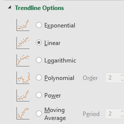
Customizing trendlines in Excel
To assign a name to your trendlines.
- Click on the chart.
- Click on the plus icon.
- Pull right on Trendlines.
- Click on More Options.
- Under Trendline Name, choose Custom.
- Type a custom name for your trendline.
That’s it, your trendline now has a custom name to it.
To change the color and fill colors of your trendlines, follow the steps below.
- Click on the chart.
- Click on the plus icon.
- Pull right on Trendlines.
- Click on More Options.
- Or, simply double-click on an existing trendline on the chart.
- Click on the paint bucket icon.
- In the Line tab, choose a color from the Color section.
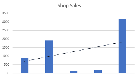
- To set a gradient line for your trendline, choose the Gradient line option.
- Select a pattern and direction for the gradience.
- To change the colors of your gradience line, change the colors of the Gradience stops.
You can see that the color of the trendlines is changed.
To change the style of your trendline, follow the steps.
- Double-click on the trendline.
- Click on the paint bucket on the right window pane.
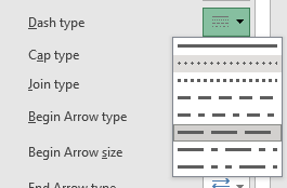
- From Dash type in the Line tab, choose your favorite style for your trendline.
- You can also select a Compound type here.
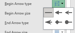
To add an end and begin arrow style for your trendlines, follow the steps below.
- Double-click on the trendline.
- Click on the paint bucket on the right window pane.
- Scroll at the bottom to find settings for begin and end arrow style and sizing.
- Choose a custom style for a begin arrow and end arrow if you like.
- Choose a custom size of the begin and end arrows.
To adjust the thickness and transparency of the trendline, follow the steps below.
- Double-click on the trendline.
- Click on the paint bucket on the right window pane.
- Choose a width you like for your trendline.
To add effects to the trendline, follow the steps below.
- Double-click on the trendline.
- Click on the pentagon on the right window pane.
- You can add a shadow effect to your trendline from Presets option here.

You can see that the shadow effect has been added to the trendline.
- Add a glow effect to your trendline by scrolling down to the Glow section in the pentagon icon.
- You can even choose a custom color, size, and transparency for the glow effect.

Conclusion
This tutorial is a detailed guide to adding a trendline to your graphs in Microsoft Excel. Stay updated for more fascinating tutorials like this only at QuickExcel!
