In this tutorial, we will learn to edit axis in Excel. We will learn in detail on adding and removing axes, axis titles, secondary axis, and swapping x and y axes and will also learn to customize an axis in a chart, step-by-step.
You may also want to read: How to Edit Legends in Excel?
Steps to Edit Axis in Excel
Let’s get started with this complete step-by-step guide to editing axes in Excel with examples and supporting images.
1. Add or remove axes in a chart
Let’s take an example of a chart to begin to edit axis in Excel
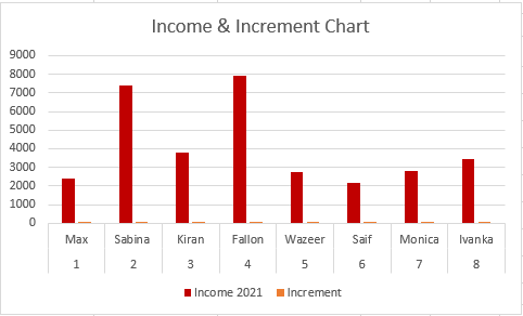
To add or remove the axes in a chart, do as follows.
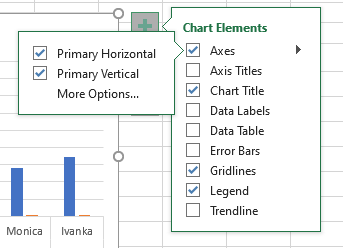
- Click on the chart.
- Click on the plus icon to open Chart Elements.
- Check on Axes if you want to view all axes in the chart and uncheck if you want to hide them.
- Pull right to view or hide the vertical and horizontal axis.
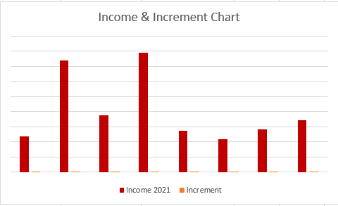
You can see that all axes in the chart have been successfully hidden.
2. Add or remove axis titles in a chart
To add or remove the axis titles in a chart, do as follows.
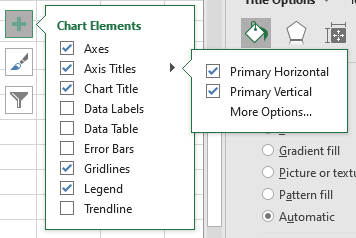
- Click on the chart.
- Click on the plus icon to open Chart Elements.
- Check on Axis Titles if you want to view all axis titles in the chart and uncheck if you want to hide them.
- Pull right to view or hide the vertical and horizontal axis.
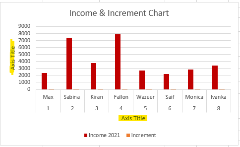
Rename Axis Titles in Excel Charts
Let’s begin editing and customizing an axis title in Excel. To rename an axis title, do as follows next.
- Double-click on the axis title.
- Type a name in the box.
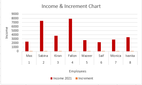
You can see that both the axis titles have been renamed in the chart.
Customizing an axis title text
Axis titles can be completely customized by changing font color, adding a border or outline color, filling a color, applying quick styles, etc.
1. Changing font color of an axis title text
To change the font color of an axis title, follow these steps.

- Double-click on an axis title.
- Select a font color from the text options that appear when a text is selected in Excel.
- Or go to the Home tab, and change font color in the Font group.
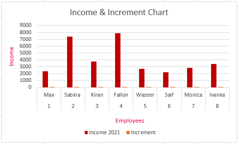
You can see that a new font has been applied to the axis titles.
2. Change text style of an axis title text
To change the font color of an axis title, follow these steps.
- Double-click on an axis title.
- Select bold, italics, or underlining options from a window that appears when a text is selected in Excel.
- Or go to the Home tab and change text styles in the Font group.
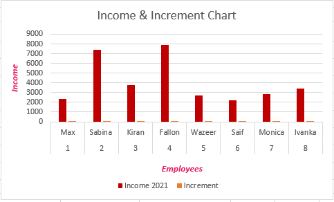
You can see that a new text style has been applied to the axis titles.
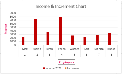
3. Adding outline colors to an axis title
To add or change a border or outline color to an axis title in Excel, follow these steps.
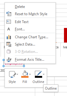
- Right-click on an axis title.
- Select the Outlines option and pick a color from the palette.
- You can even choose styled borders by clicking Dashes in this option.
4. Filling a color or applying quick styles to axis titles
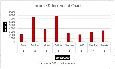
You can even apply quick styles or manually fill colors in an axis title text.
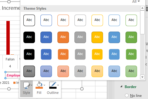
- Right-click on an axis title.
- Select the Styles option and pick a style from it.
- You can choose between filled and unfilled colored styles here.
- Or fill colors by selecting the Fill option and picking a color you like.
Edit Axis in Excel Charts
You can have multiple editing options for the horizontal and vertical axes in a chart in Excel. Let’s look at the multiple ways you can edit axis in Excel.
Editing the horizontal axis in a chart
To hide or unhide columns on an axis, do as follows.
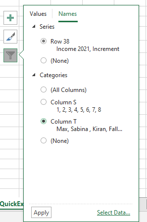
- Click on the horizontal axis or the chart area.
- Then click on the filter icon at the top right corner.
- Go to the Names tab.
- Choose All Columns to view all the columns of the table on the horizontal axis.
- Choose a specific column to just view that column on the axis.
- Click Apply to view the changes.
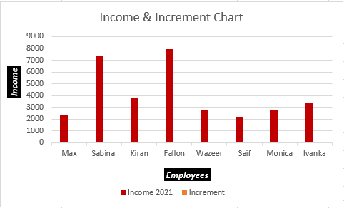
You can see that all serial numbers from the table have been removed from the chart making it more meaningful.
Another way you can hide or unhide columns in an axis is as follows.
- Click on the horizontal axis or the chart area.
- Then click on the filter icon at the top right corner.
- Click on Select Data.
- Click in the Chart data range text box and notice that the entire table has been selected.
- Remove the selection from the table and make a new selection including only the desired columns, like this.
- Click OK.

Notice that we have only selected 3 columns in the data range and excluded serial numbers from the selection.
None of the serial numbers from the table are being reflected on the chart.
Changing axis values in a chart
The vertical axis in a chart is usually in numerical form. Let’s see how we can edit the numerical data in the axis.

You can see that the vertical axis in this chart ranges from 0 to 10,000. You can always edit this range in Excel.
- Double-click on the vertical axis.
- A window on the right opens names Format Axis.
- Remain in Axis Options and click on the bar chart icon named Axis Options.
- Set a minimum and a maximum number of the range.
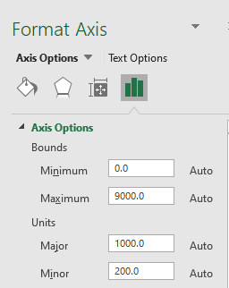
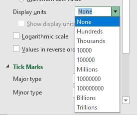
To change the display units.
- Scroll down until you see Display Units.
- Select the desired display unit.
Customizing axes texts
To change the color of the axes text, do as follows.
- Click on the axis you want to change the color for.
- Go to Text Options in the Format Axis window.
- Change the text color under the Text Fill heading under the Text Fill & Outline tab.
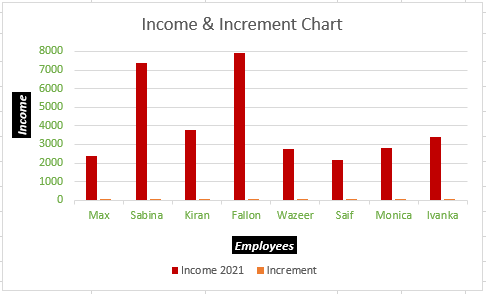
You can see that the text color has been changed.
How to Add a Secondary Axis in a Chart?
In Microsoft Excel, you can have a secondary axis for your charts to arrange and represent your data logically.
To add a secondary axis to a chart, follow the steps below.
- Click on the chart.
- Go to the Insert tab.
- Select Recommended Charts under Charts.
- Select the chart with a secondary axis under Recommended Charts.
- Click OK.
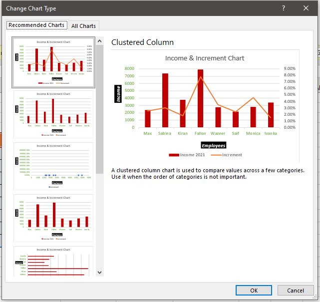
Another way to insert a secondary axis is as follows.
- Click on the bar series which you want to convert to the secondary axis.
- If they are too small click on any bar and press Tab on your keyboard.
- Right-click on a series and press Format Data Series.
- Select Secondary Axis under Series Options.

Now, this is how your chart should look like after making the changes.
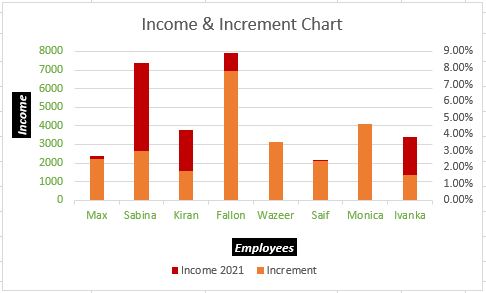
- Right-click on a series once again.
- Select Change Series Chart Type.
- Set the Increment series to Stacked Line with Markers.
- Click OK.
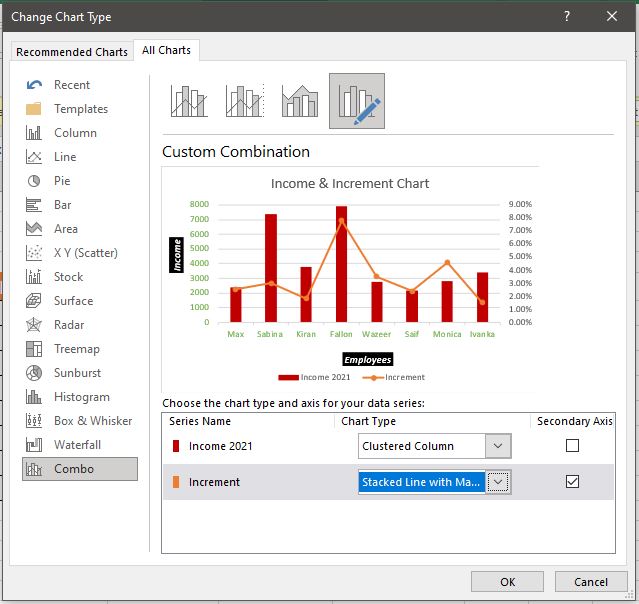
How to Switch X and Y-Axis in a Chart?
Let’s begin swapping the X and Y axis in Excel with the help of a sample chart below.
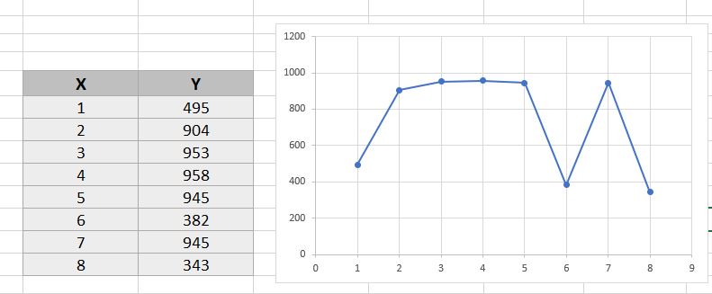
To transpose the X to Y and Y to the X-axis follow these steps.
- Click on the chart.
- Go to the Design tab.
- Click on Select Data under Data.
- Click on Edit on the left.
- Empty the contents in Series X values and select the contents of the Y column.
- Empty the contents in Series Y values and select the contents of the X column.
- Click OK.

You can see that the axes in this chart have been swapped successfully.
Conclusion
This article was a detailed step-by-step guide on editing axes in a chart in Microsoft Excel. Comment below if you have any doubts regarding editing axes in Excel.
