In this tutorial, we will learn to create a scatter plot in Excel. Scatter plots are used to determine the correlation between two variables on the vertical and horizontal axes of a chart. With scatter plots or scatter graphs, we can determine if there is a positive, negative, or zero correlation between two variables that are being compared.
Also read: How to Create a Flowchart in Excel?
Steps to create a scatter plot in Excel
Let’s get started with creating a scatter plot with the help of these two variables below.
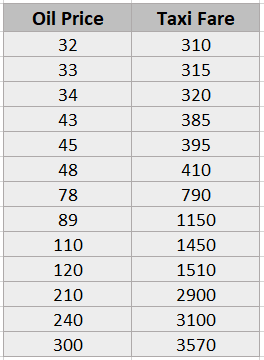
We see that there are two variables in the table i.e., oil price and taxi fares. Let’s find out the correlation between these two variables by creating a scatter plot. To create a scatter plot or scatter graph, follow these steps.
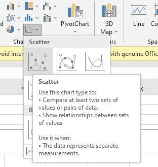
- Select the entire table.
- Go to the Insert tab above.
- Under the Charts group > select the Scatter or Bubble Chart icon.
- Choose the first scatter graph which is a basic scatter plot format.
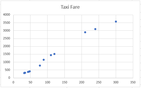
You can see that a scatter plot has been created in Excel. You can clearly determine that there is a positive correlation between the two variables. Meaning, as oil prices increase, taxi fares also increase positively.
Let’s make the graph more meaningful and understandable by adding a trendline to it. A trendline will help us determine in a better way if there is a negative, positive, or zero correlation between the two variables.
Adding a trendline to a scatter plot in Excel
- Right-click on any scatter point in the chart.
- Select Add Trendline.
- A window on the right opens named Format Trendline.
- You can choose from multiple trendline styles, but the most recommended styles are Exponential and Linear styles.
- We have selected the exponential style for better understanding.
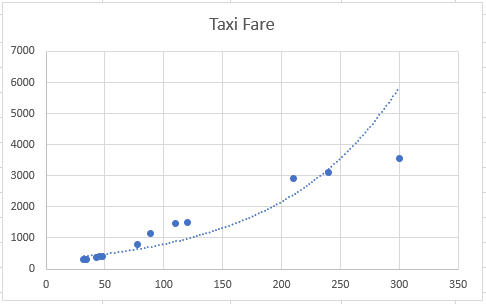
You can see a curved line moving upward from left to right showing a positive correlation between the variables.
Similarly, you can show negative and zero correlation between two variables on a scatter plot in Excel this way.
Customizing a scatter plot in Excel
Let’s begin customizing scatter plots in Excel step-by-step with supporting images below.
Changing the look and color
To change the chart look, follow these steps.
- Click on the chart.
- Click on the paintbrush on the top right.
- Choose different chart styles under the Styles tab and series color under the Color tab.
Take a look at this new look at our scatter plot.
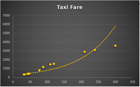
Another way you can change colors and styles is as follows.
- Click on the chart.
- Go to the Design tab that appears above.
- Under the Chart Styles group, select a chart style you like and pick the chart color you like for your scatter graph.
To change the color of points on a scatter plot, here’s what you can do.
- Right-click on any point on the plot.
- Open Fill options and pick a color you like.
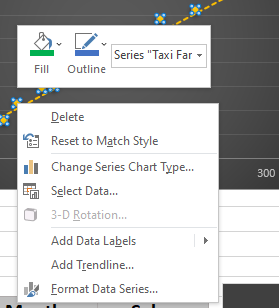
To change the color of the trendline, do as follows.
- Double-click on the trendline.
- A window named Format Trendline opens at the right.
- Select the bucket icon at the top.
- Change color under the Line tab.
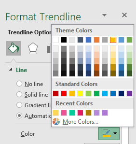
To change the layout of the plot follows these steps.
- Click on the chart.
- Go to the Design tab.
- Pull-down on Quick Layouts.
- Select a layout you like for your plot.
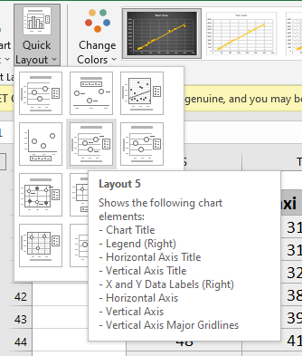
Hide or unhide elements in a chart
To hide or unhide chart elements in a scatter plot, here are the steps.
- Click on the chart.
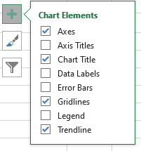
- Click on the plus icon on the right corner.
- Check the elements you want to see and uncheck the ones you want to hide.
- You can choose to hide or unhide gridlines, legends, axes, axis titles, or trendlines, etc. on a chart here.
Recommended read: How to Edit Axes in Excel?
Changing chart type from scatterplot to others in Excel
To change the chart type from a scatter plot to any other type you like, do as follows.
- Click on the chart.
- Go to the Design tab.
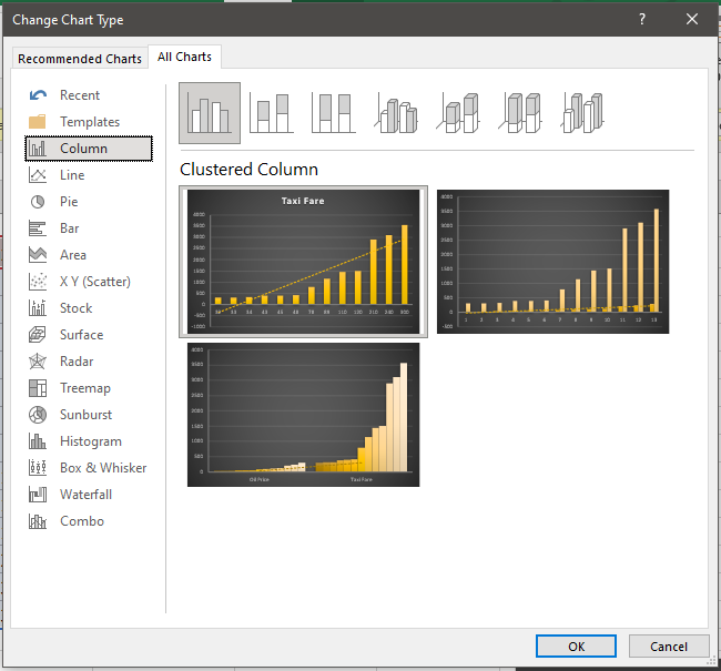
- Under the Type section select Change Chart Type.
- You can either choose to select a different kind of scatter or bubble chart or transform this existing chart to a different type like a bar chart or a pie chart etc.
Conclusion
This article was all about creating and customizing a scatter plot from scratch. Follow this step-by-step guide and you’ll know exactly how to create a scatter plot in Excel. Don’t forget to comment below if you have any doubts regarding the scatter plots in Excel!
