Column charts go as far as comparing a couple of entities side by side, but what if one wants to compare multiple attributes of a subject in a study across the same 2-dimensional plane? Yep, you read that right – a 2-D-plane! MS Excel is equipped with just the feature that would help us in creating one.
Enter the RADAR PLOT!
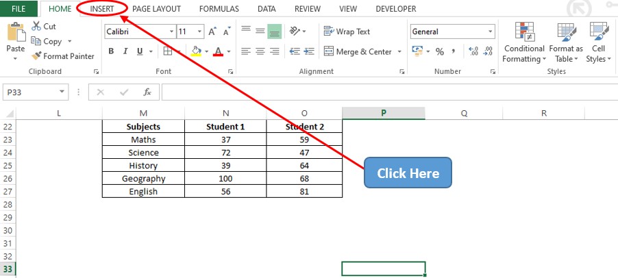
Radar plots give us a fair picture of how different entities vary across a common metric for an individual or anything that is being studied. This article shall demonstrate how the marks of 2 students vary across different subjects using a radar plot. Following is the data that shall be used.

Before getting on with how to create a radar plot, let us first have a look at its different types.
Also read: How to Create 3D Column Charts in Excel?
Types of Radar Plot
There are 3 different types of radar plots based on the way in which it displays the data, viz.
- Radar Plot with Lines – In this chart the variables belonging to the object under study shall be connected with each other. But the main drawback is that one can’t locate the exact point that depicts the corresponding value of the variable.
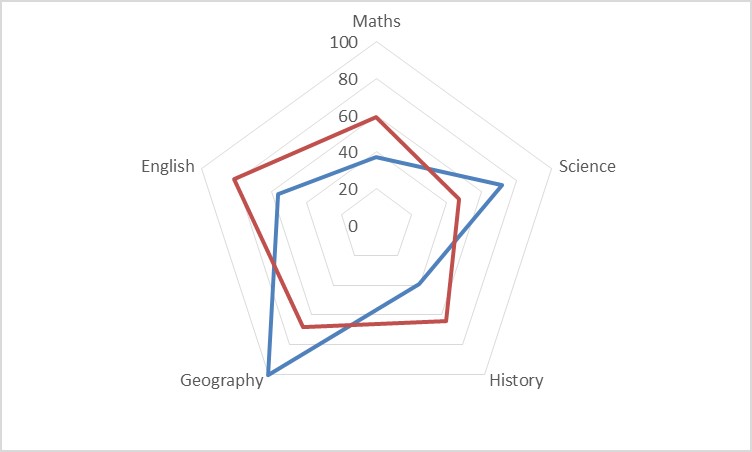
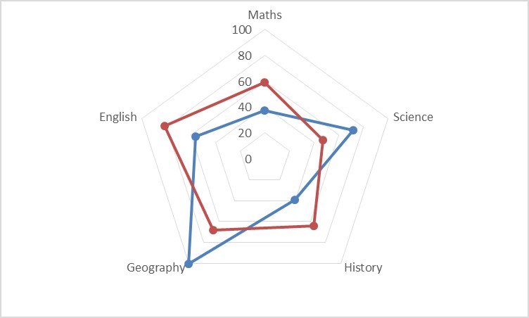
- Radar Plot with Markers – This chart overcomes the setback of the previous type by introducing markers which make life easier for us to locate the points depicting the corresponding value of each variable that has been plotted.
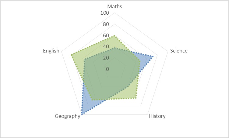
- Radar Plot with Filled Area – This chart is a tad bit different from both charts listed above. Rather than using lines, this type makes use of the entire area filling it with different colors to compare & contrast the different entities under study.
Steps for Creating Radar Plot in Excel
Let us get started by clicking on the Insert tab among the list of available tabs as shown below.
Once within the Insert tab, get into the Charts section & click on the Web icon as shown below.
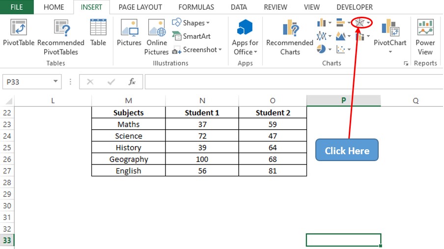
Once done, there shall be a drop-down menu appearing as indicated in the below image with a list of variants to choose from. Select the radar plot of your desire. The radar plot with markers shall be chosen for this demonstration.
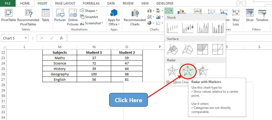
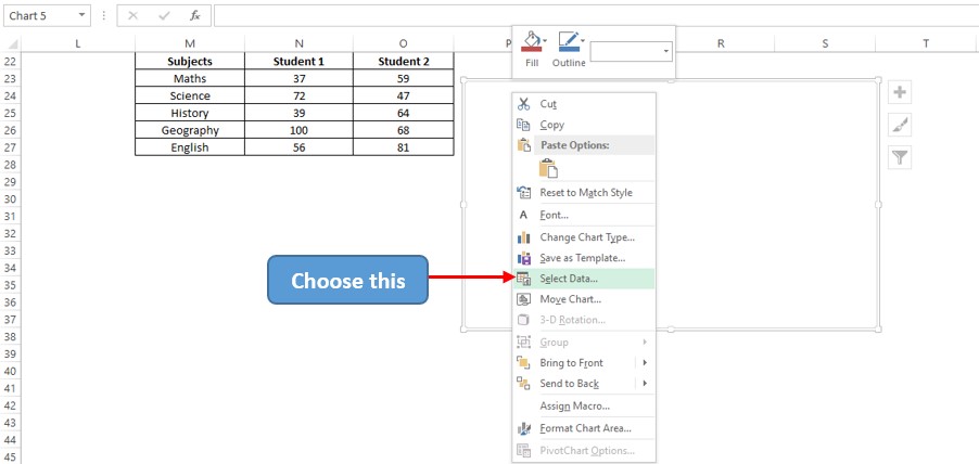
A blank chart area now appears! Right click on that & choose the Select Data option as shown below.
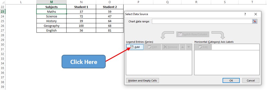
A Select Data Source pop-up shall appear now. Click on the Add option as indicated in the below image.
Now a dialog box titled Edit Series shall appear. Click on the arrow icon within the Series Values field to select all the values listed under Student 1. Now left click on N23 and drag till it reaches N27.
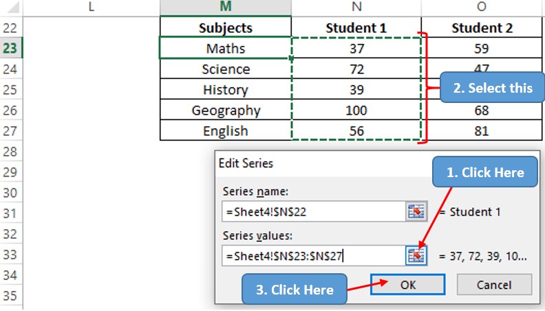
Hit ENTER and again follow the same sequence to select all the marks listed under Student 2.

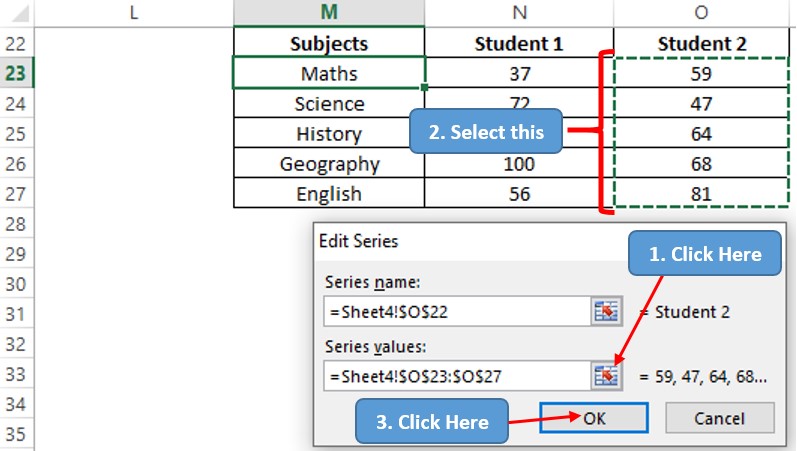
Hit ENTER & we are again taken back to the Select Data Source pop-up. Click the Edit icon on the Horizontal Axis Labels section to select the labels that shall appear in each of the axes.

Now the Axis Labels pop-up appears. Follow the same steps as previously stated to select the data range of subjects that shall appear across each axis.
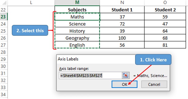
Hit ENTER & we are taken back to the Select Data Source pop-up. Hit ENTER again & we are taken back to the sheet which now has a radar plot with markers in view!

Conclusion
Have a look at this article which details the creation of 3D Column Charts. There are numerous equally interesting & informative articles in QuickExcel that shall serve as a lamp to those who pursue their journey to excel in MS Excel. Hope this article helped you understand how to create a Radar Plot in MS Excel! Adios.
