Peeps nowadays would remember playing Clash of Clans back in their school or college days, but way back in the ’90s when a calculator was the most advanced handheld digital device of that time, there was a game franchise that placed the seed for these strategic games years down the line. Those who have played it might have guessed what it is at least after a glance at the below image.
Also read: How to Create Clustered Bar Charts in Excel?
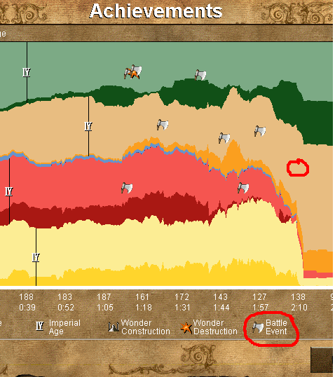
Yep! It is the Age of Empires, a strategy game where one can role play different civilisations across various timelines & what’s more interesting is the summary one would get at the end of the game in the form of the area chart given in the above image!
In this article, we would be exploring in great depth what an Area Chart is & its different types that can be put to use in MS Excel. Following is the dataset that shall be used for demonstration.

Area Chart and its Types
An area chart is one in which the evolution of variables across an axis is plotted continuously filled with different colors, unlike the bar chart in which each variable is shown as a bar separated from each other or the line chart in which each variable is joined together by a line leaving the area below untouched.
Following are the different types of Area Chart available in both two-dimensional & three-dimensional formats in MS Excel.
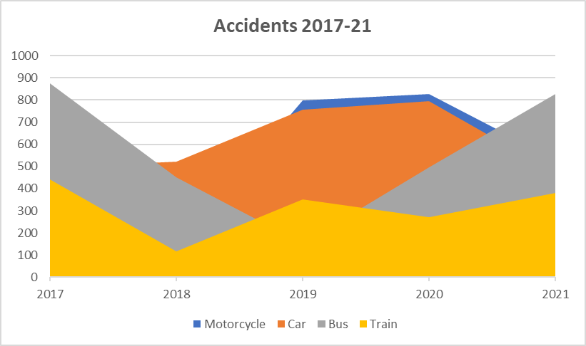
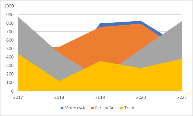
- Regular Area Chart – In this type the variables of different entities will be placed one upon the other after reducing the value of the least variable. For instance, in the below chart, the accidents by buses are 875(approx.) for 2017 & by trains 450(approx.), but the area below 450 has been filled with the yellow shade for trains & only those above 450 to 875 are filled with the grey shade for buses.
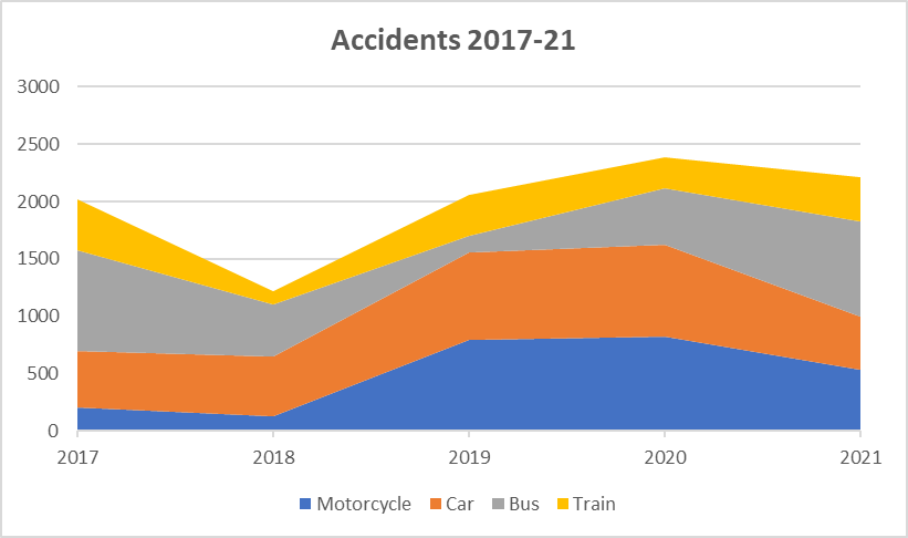
- Stacked Area Chart – In this type, values of all entities are added upon each other rather than deduction as shown in the above image. It could be seen in the below image that the total matches that of the dataset given earlier owing to the fact that the entities are added with each other.
- 100% Stacked Area Chart – This chart depicts the contribution of each entity in the form of percentages with the total summing up to 100%. So consider it as a perfect rectangle with the colours for each entity varying within it over the axis.
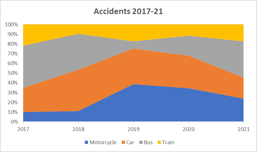
Creating an Area Chart
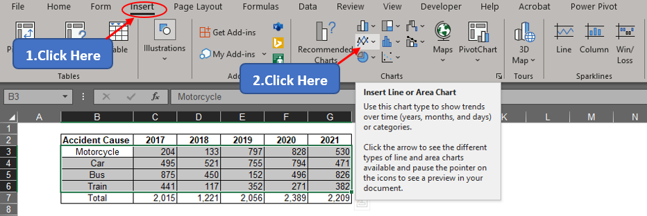
The procedure remains the same irrespective of the Area Chart type that one wants to create. In this article, we shall demonstrate using a Regular Area Chart. One shall get started by selecting all the data to be plotted.

Once done, get into the Insert tab & click on the Line or Area Chart icon as indicated in the below image.
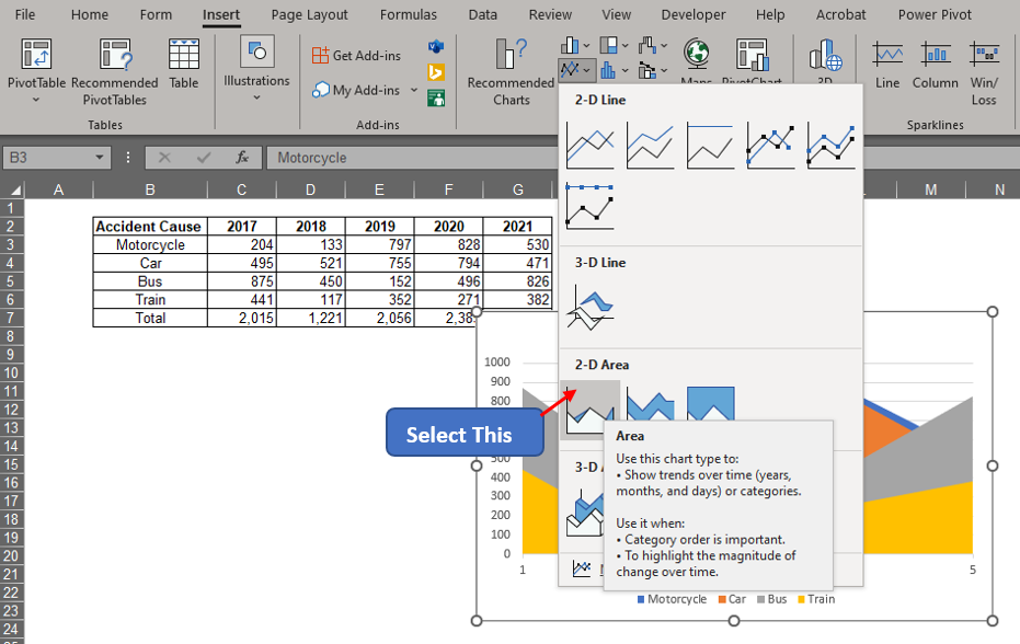
Select the regular Area Chart option in the dropdown that appears as shown below.
Now one can see the chart appearing, but the horizontal axis titles seem to be a bit bleak. Set it right by right-clicking anywhere within the chart area & choosing select data.
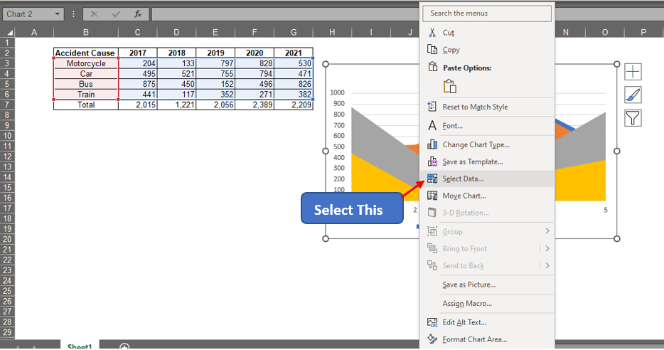
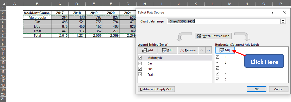
Click on the Edit button under the Horizontal Axis Labels to select the years from the data.
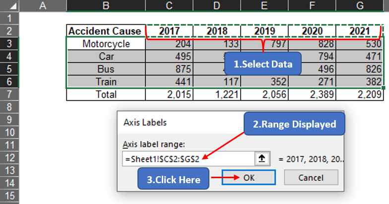
The Axis Labels pop-up appears. Select the cells C2 to G2 containing the list of years as shown below.
Click OK until you reach the chart & the changes become visible.
Conclusion
Have a look at this article, if interested in knowing about creating Bar Charts. There are numerous other articles in QuickExcel for those who want to know more about the tricks & nuances of using MS Excel. Adios!
