The functionality of MS Excel is not only limited to the usage of formulae to analyse & deduce meaningful inferences from a set of data but also extends to the usage of non-verbal interpretation techniques such as creating charts & graphs to provide the much-needed data visualisation.
In this article, we would be looking into the different ways of creating graphs & also analysing the requirements that each graph would best serve.
Types of Graphs in MS Excel
Let us start things by getting to know the different types of graphs that MS Excel has got to offer.
- Column Charts
- Line Charts
- Pie Charts
- Bar Charts
- Area Charts
- Scatter Plots
- Stock Plots
- Surface Plots
- Radar Plots
- Combo Charts
Well, that is an extensive list of options that any spreadsheet package can offer & we shall see what each one does. In order to a create graph of any kind one shall start by selecting the data which is to be plotted onto the graph.
Selecting the Data
The pre-requisite to plot any graph is to have data for all its axes – for both X & Y axes in the case of a two-dimensional plot or for X, Y & Z axes in the case of a three-dimensional plot.
Let us have a look at the following data & find what dimensional plot can be created using it.
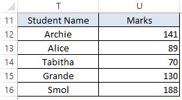
The data has been categorised into 2 columns – one containing the names of all students titled Student Name & the other containing the marks obtained by each of them as Marks. This can right away be translated to the X & Y axes of a graph inferring that these data are suitable for plotting a two-dimensional graph.
On the other hand, having a look at the below data tells us that there is an additional component Section which contains the information on the section that each of these students belongs.
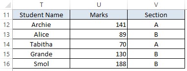
This additional column of data can be related to the Z-axis, thereby making these data suitable for a three-dimensional plot.
Now that we know how to identify the type of plot that can be created from any given data, let us move towards choosing the right graph to plot them.
Plotting the Data
For a two-dimensional plot of students vs marks, select the data as shown below.
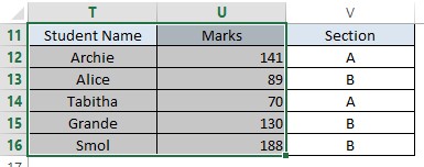
Once done, hover the cursor towards the tabs section & select the Insert tab as shown below.
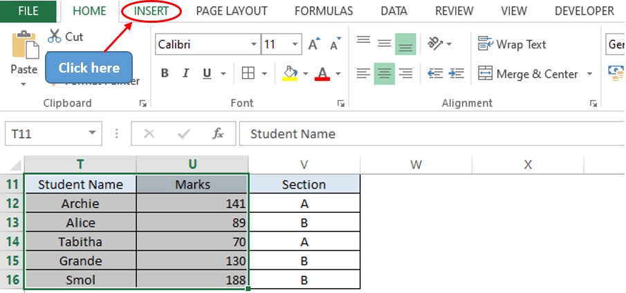
Within the Insert tab, one can find the Charts section. Those who are using the recent versions of the MS Office package might be blessed with the Recommended Charts feature which suggests the different charts that can be plotted using the selected data.
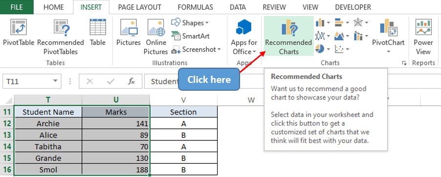
Click on the icon as shown above and the Insert Chart dialogue box appears.
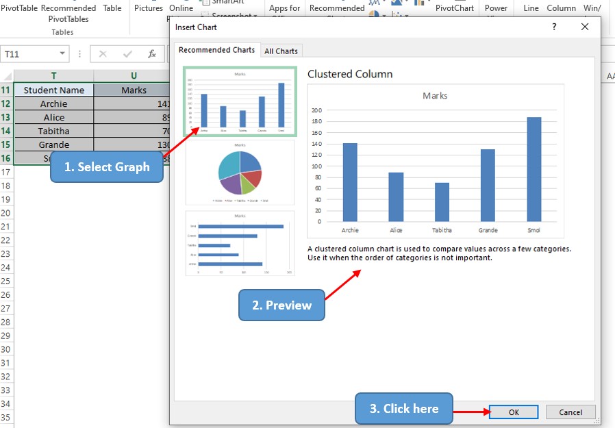
MS Excel has identified 3 possible ways of plotting the selected data viz. a Clustered Column Chart, a Pie Chart & a Bar Chart. For the purpose of visualising the marks of the students, a Clustered Column Chart would be the most preferred among these three.
Upon selecting this chart, one can also sneak a peek into how the graph might look in the Preview pane as indicated in the above image. Upon selecting the graph that serves the purpose, click OK.
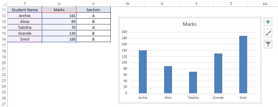
The plus sign at the top right corner of the graph can be clicked to exercise a variety of options such as,
- Axes Display
- Axes Titles
- Chart Title
- Data Label
- Data Table
- Error Bars
- Gridlines
- Legend
- Trendline
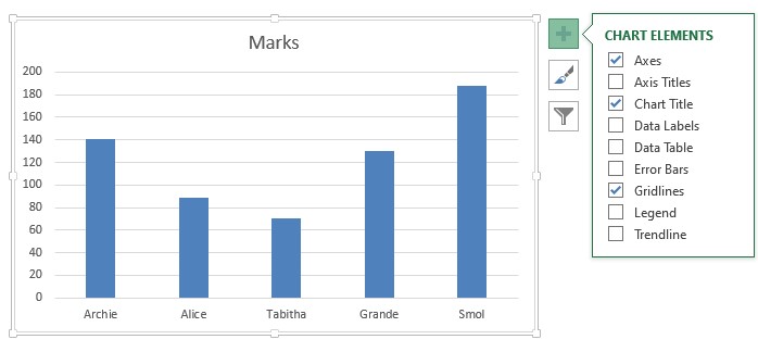
One can add more details to the chart by using these options from the Chart Elements.
Summary
That’s the end of this article. Hope now you would be familiar with the different options that MS Excel provides to visualize your data using graphs. For more such tips and tricks on using MS Excel, please do look into our space QuickExcel. Until then, adios!
