Let’s learn how to create a pie chart in Excel. Visual representation of data is of crucial importance in data analysis, handling and representation. Microsoft Excel allows you to visually represent your data via pie charts and many other data charts.
Recommended read: How to shade alternate rows in Excel?
Steps to create a pie chart in Excel
Let’s get started with this step-by-step guide to creating a well-ordered pie chart in excel.
1. Prepare a tabular dataset
To begin creating a pie chart, you would require a tabular representation of your data to be prepared in your sheet. Let us take an example of tabular data here-

2 . Creating a Pie Chart
We see that there are income records of 8 employees available before us. Now, we want a visual representation as to who has a fairly large or small amount of income.
You would need to create a pie chart of this tabular data. Here is how-
- Select the entire table.
- Go to the Insert tab.
- Under the Charts section, click the Pie or Doughnut Chart icon.
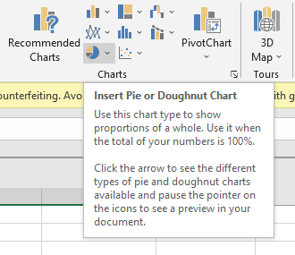
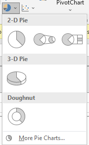
- You can select between 2D, 3D, and Doughnut charts.
- We have selected a 2D chart for instance here.
You can now see that a 2D pie chart has been created with legends below the chart.

Also read: How to calculate the square root of a number in Excel?
3. Customizing a Pie Chart
Pie charts in excel are fully customizable. If you don’t like something about the chart, you can always change it. Here is how you can customize a pie chart-
- Click on the pie chart.
- Select the paintbrush icon to choose Chart Styles.
- You can see a variety of chart styles available to you. Choose from the styles you like.
- Go to the Color tab to change the color combinations of your pie chart.
- Click the paintbrush icon again to close styling options.
This is how our newly styled pie chart looks like now-
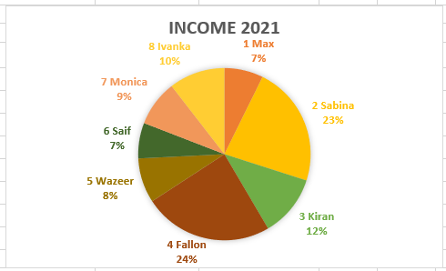
Another way to change the style and color of your pie chart is by going to the Design tab that is available only while a pie chart is selected.

4. Customizing legends
You can manually customize the legend position and style like this-
- Select the pie chart.
- Go to the Design tab.
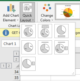
- Under the Chart Layouts, pull-down Quick Layouts.
- Select the desired layout you want for your legends.
Conclusion
This was all about creating a pie chart from scratch and customizing it to your will. If you have any questions regarding pie charts in Excel, feel free to post a comment and we will help you out!
