This tutorial is all about creating heatmaps in Excel. Heatmaps are highlighted markings colored in green to red in a table depicting low to high values in Excel. We are going to create heatmaps using advanced conditional formatting tools. So, we hope that you are already aware of the conditional formatting tool in Excel.
If you want to learn the basics of the conditional formatting tool, read here.
What is Conditional Formatting? 11 Ways to Use Conditional Formatting in Excel
We will also look at creating heatmaps on pivot tables in Excel, so make sure you read till the end.
Cells highlighted in green depict high values, yellow depicts moderately low, and red depicts low values in a heatmap. Don’t worry, you can always set the colors you like for your heatmaps if you do not like to go by the classic way.
Steps to create heatmaps in Excel with conditional formatting
Let’s get started with the easy steps to create heatmaps to a range with conditional formatting.
Here is an example of a mark list of students. We are going to apply heatmaps on the number of survey participants in a given month.
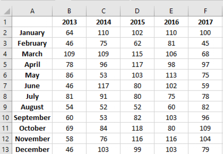
Follow the steps to apply heatmaps to this mark sheet.
- Select only the cells with numbers in the survey sheet
- Go to the Home tab.
- Pull down on Conditional Formatting.
- Hover over Color Scales.
- Choose the first style option to apply yellow, red, and green color scales. You can choose other options if you only want a 2-color scale.
To add a custom color scale to your datasets, click on More rules.
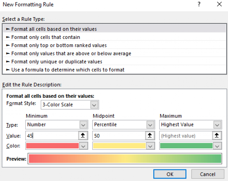
- Select 2-color scale or 3-color scale from the Format Style menu.
- Choose your favorite colors based on your color scale preferences.
- Click OK.
You can see that we have added the heatmaps to a range in Excel.
Steps to add heatmaps to pivot tables
Let’s get started with the easy steps to create heatmaps to a pivot table with conditional formatting.
Also read: Creating a Pivot Table in Excel
We are going to apply heatmaps on the data of survey participants to understand which month has the highest activity.
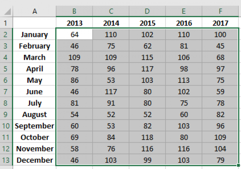
Follow the steps to apply heatmaps to this mark sheet in a pivot table.
- Select only the cells with numbers in the table.
- Go to the Home tab.
- Pull down on Conditional Formatting.
- Hover over Color Scales.
- Choose the first style option to apply yellow, red, and green color scales. You can choose other options if you only want a 2-color scale.
To add a custom color scale to your tables, click on More rules.

- Select 2-color scale or 3-color scale from the Format Style menu.
- Choose your favorite colors based on your color scale preferences.
- Click OK.
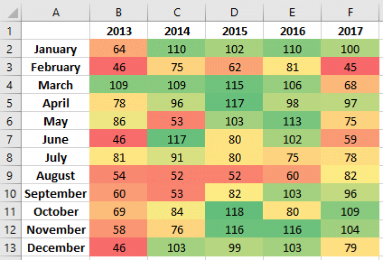
You can see that we have added the heatmaps to the pivot table in Excel.
Conclusion
This tutorial was a detailed guide on creating heatmaps in Microsoft Excel. Stay tuned for more amazing articles like this only at QuickExcel.
