Seeing things in two dimensions can bore you to death at times. A little bit of graphics take the same thing and turns it into a beautiful sight for your sore eyes. We are going to carry out one such thing moving forward. This article is dedicated to demonstrating the construction of a 3D Bar Chart in MS Excel. Are any cricket fans reading this? So, how about we put some data from cricket & transform it into one?
Following is the data set that we shall use throughout this article.
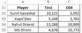
For those who don’t fancy cricket – the above data are the points scored by different players in different formats of the game. Enough of explaining the data & let’s get to the good stuff!
Also read: How to Create 3D Column Charts in Excel?
Steps to Create 3D Bar Charts in Excel
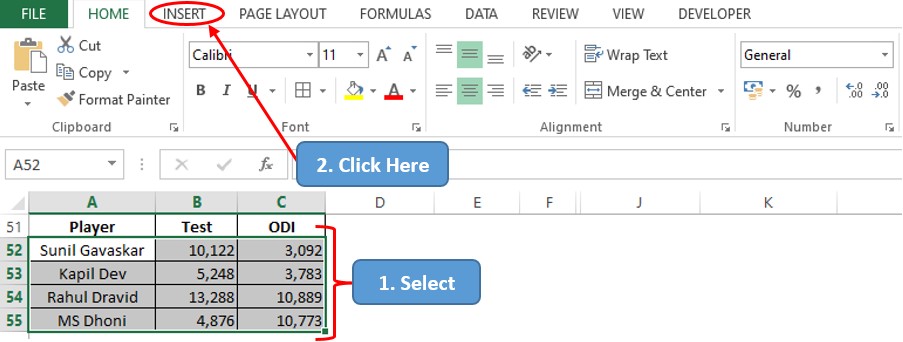
One shall get things started by selecting the data for which the 3D bar chart is to be created & getting into the Insert tab among the list of available tabs as shown below.
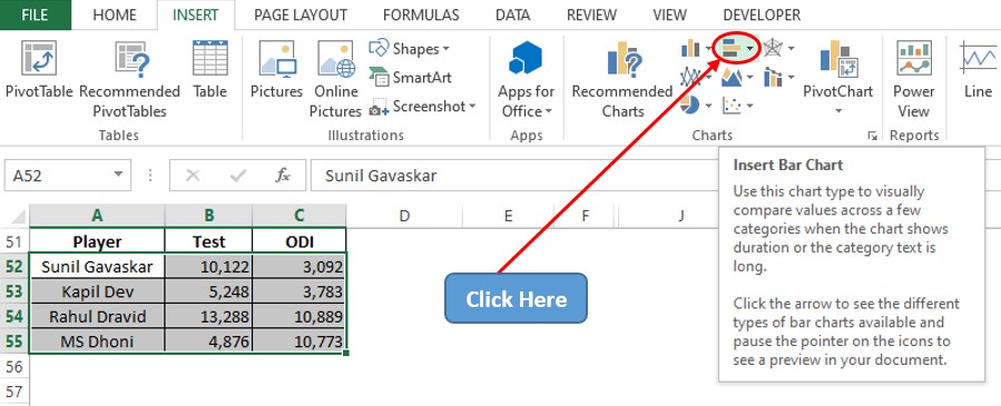
Once within the Insert tab, get into the Charts section & click on the icon for Bar Charts as indicated below.
Now there shall be a drop-down menu appearing as indicated with the different variants in bar charts. All eyes on the 3D bar section please select the icon of the 3D Stacked Bar Chart as indicated (The following procedure remains the same for the other types of 3D Bar Charts too).
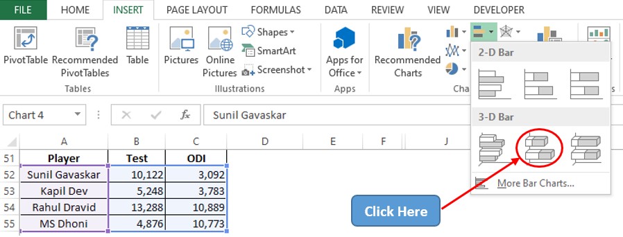
Since the data has already been selected the 3D Stacked Bar Chart now appears before your eyes!
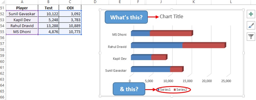
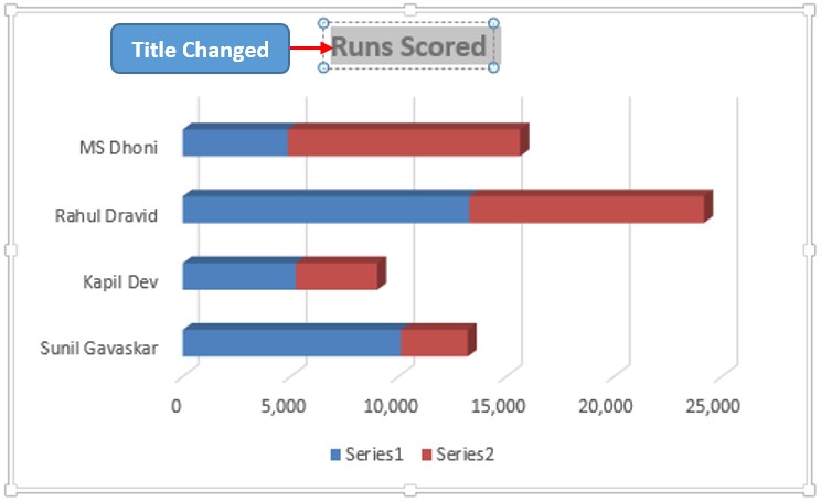
But something is fishy, ain’t it? The Chart Title & the Legend section are filled with the default values. So, let us change these, one by one. First off, let us attack the Chart Title section by double-clicking on it, & replacing the default values with the title of our choice.
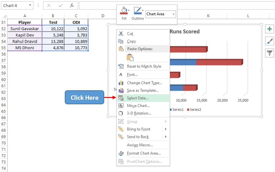
Now time to change the Legend by right-clicking anywhere within the chart area & choose the Select Data option as shown below.
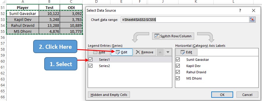
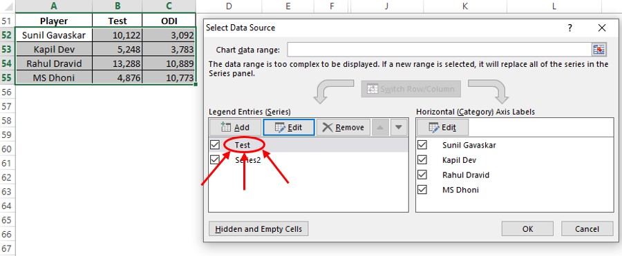
Now the Select Data Source pop-up appears. Get into the Legend Entries section, select the Series1 option & then click on the Edit option.
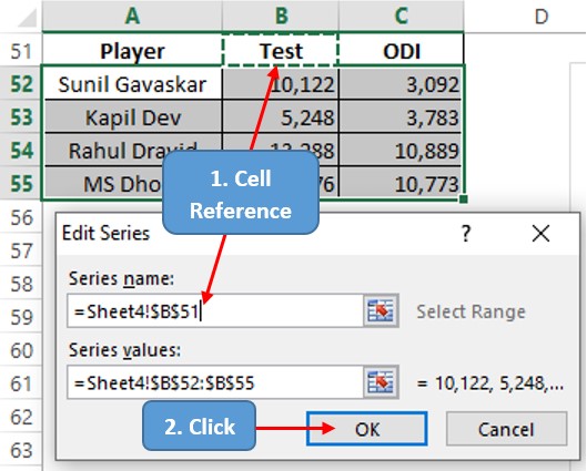
The Edit Series dialog box appears now & one can either type the name for Series1 or give a reference to the cell which contains it. We shall adopt the latter approach as indicated in the image below. Click OK once done.
One can now see that the name of the series has been changed to Test as depicted below.
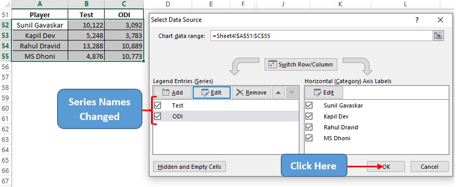
Follow the same procedure to change the name of Series2 too & then click OK in the Select Data Source dialog box.
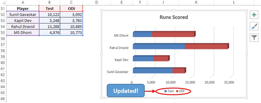
The updated chart reveals itself the very moment OK is clicked with much more clarity & ease to be comprehensible now.
Well, it’s great that we can get this far but, what if one wants to change the orientation of this three-dimensional bar chart a tad bit in any direction of choice?
Modifying Chart Orientation:
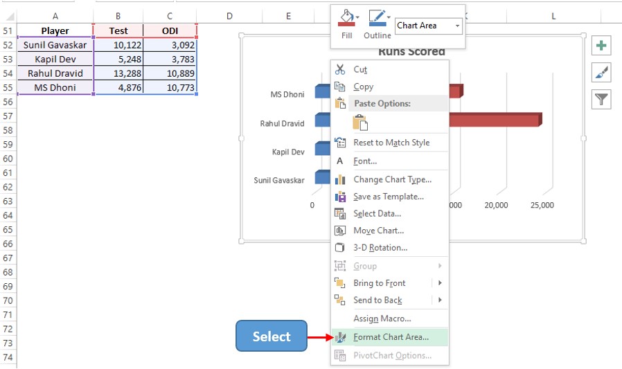
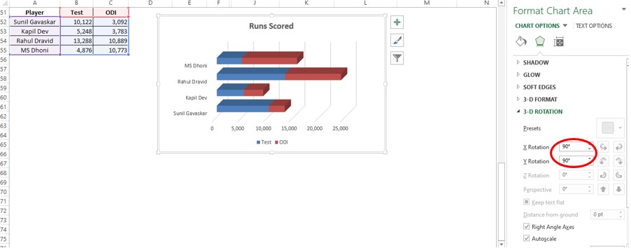
Right-click anywhere within the chart & choose the Format Chart Area option. A pallet appears on the right side of the screen. Choose 3D Rotation within that & change the X-Y rotation as required.

Conclusion
Have a look at this article, in case you would like to know about creating 2D Bar Charts in MS Excel. There are numerous equally interesting & informative articles in QuickExcel that serve to be a great help to those who pursue their journey to excel in MS Excel. Hope this article helped you understand how to create a 3D Bar Chart in MS Excel & has given you what you came looking for! Cheers.
