Adding a bit of graphics to visual interpretation will always make things look great! We humans always have had a thing for the third dimension. So let us apply it to the chart which shows the evolution of data under each category over a period.
Also read: How to Create Area Chart in Excel?
Steps to Create 3D Area Chart in Excel
Yep, it is going to be the 3D Area Chart and this article will demonstrate its construction using the following dataset containing the sales of cars and 2 two-wheelers for a 15-year period from 2001 – 2015.
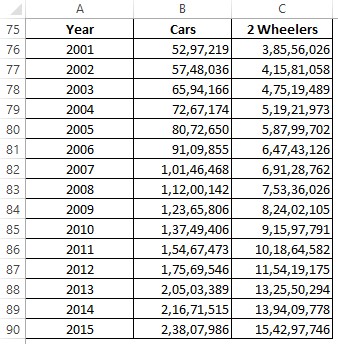
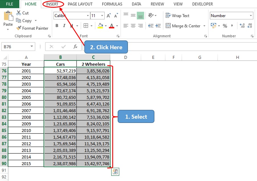
To get things started, one shall select the data for which the 3D area chart is to be created, which in this case would be B76:C90, followed by getting into the Insert tab among the list of available tabs as shown below.
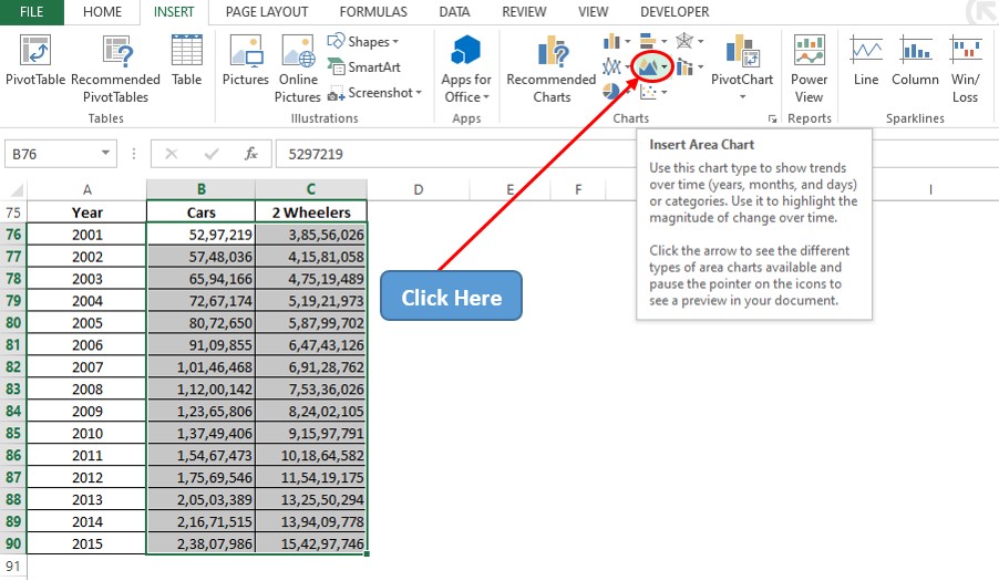
There are plenty of options available within the Insert tab, but one shall get into the Charts section & click on the icon for the Area Charts as indicated below.
Now a drop-down menu shall appear with the different variants in area charts listed in both two-dimensional & three-dimensional formats. Our focus shall be on the three dimension chart section, where we shall select the 3D Stacked Area Chart. Regardless of the choice made in this drop-down list, it is to be noted that the following procedure remains the same for the other types of 3D Area Charts as well.

Since we have already selected data before choosing the chart type, now a 3D Stacked Area Chart appears before your eyes!
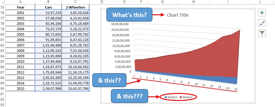
But something seems strange! The Chart Title, Horizontal Axis Values & Legend section are filled with the default values. Not a good thing to retain while presenting some information. So, let us get on with changing these, one by one.
Changing Chart Title
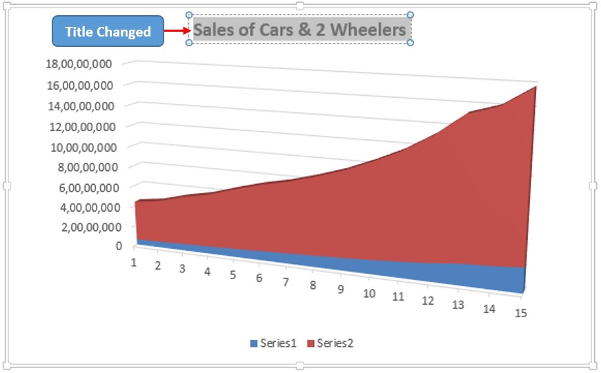
Firstly, let us double click on the Chart Title section & replace it with the title – ‘Sales of Cars & 2 Wheelers’. Going a step further, the title shall be made bold by using the keyboard shortcut CTRL+B, for better visibility.
Changing Axis Values & Legend
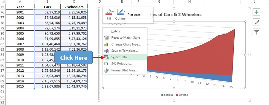
Now time to change the Legend and Horizontal Axis Values by right-clicking anywhere within the chart area & choose the Select Data option as shown below.
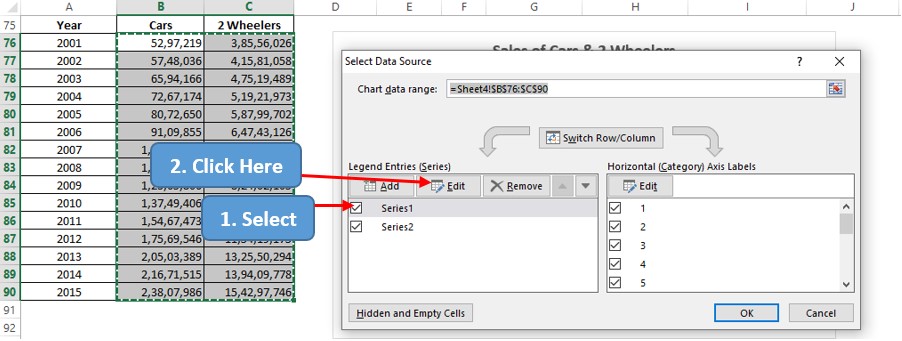
Now a pop-up titled Select Data Source appears. Get into the Legend Entries section, select the Series1 option & then click on the Edit option.
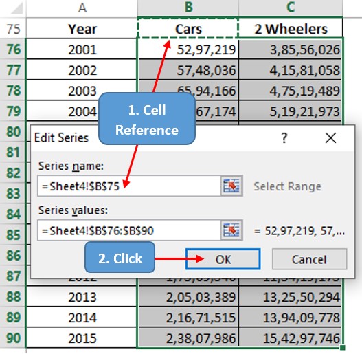
The Edit Series dialog box shall appear where one can either type the name for Series1 or give a reference to the cell which contains it. Let us be professional here & choose the latter approach as indicated in the image below. Click OK once done.
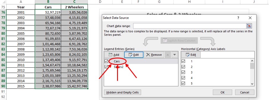
Now we are taken back to the Select Data Source pop-up where the name of the series has been changed to Cars as shown below.
Follow the same procedure to change the name of Series2 too & then click OK in the Select Data Source dialog box.
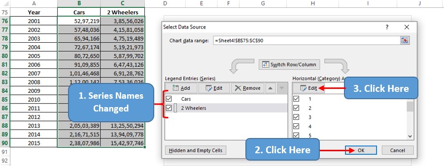
Once done, click on the Edit button under the Horizontal Axis Labels section to change the values across the horizontal axis. The Axis Labels pop-up appears & the column containing the years shall be selected.
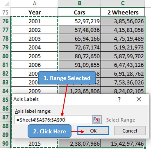
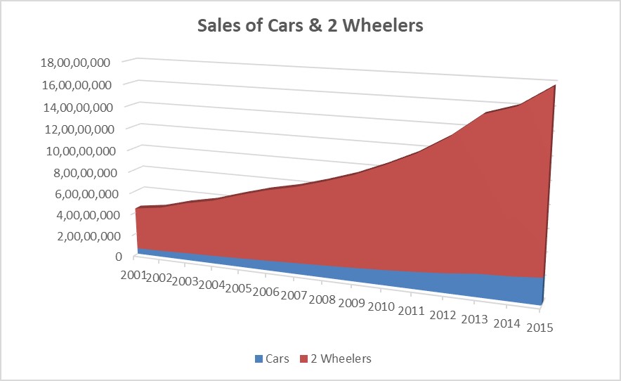
Click OK & we are taken back to the Select Data Source dialog box. Click OK again & the very next moment the updated chart reveals itself.
Conclusion
Have a look at this article, in case you would like to know about creating 2D Area Charts in MS Excel. There are numerous equally interesting & informative articles in QuickExcel that serve to be a great asset to those who pursue their journey to excel in MS Excel. Hope this article has helped you to understand how to create a 3D Area Chart in MS Excel & has given you what you came looking for! Adios.
