There are times when a process is affected by more than one variable. In this case, the right thing to do would be to find the sweet spot for each of those independent variables so that the resultant output which is dependent on them can be maximized. To do this one ought to find the optimum combination of these variables.
Take all these requirements and ask Excel what to do, it shall show us the direction to the Surface Plot! It is the go-to data visualization tool to find the optimum combination of these variables by plotting them in a three-dimensional surface meshed within the axes.
Steps to Create A Surface Plot in Excel
The dependent variable is plotted along the vertical axis, whilst the independent variables are plotted along the horizontal axis. We shall further explore this tool to its greater depths in this article.

The above is a set of test results for Sealing Strength which is dependent on the below variables.
- Sealing Temperature
- Batch Type
So, the Sealing Strength is to be plotted along the vertical axis & the independent variables – Sealing Temperature and Batch Type will be plotted along the horizontal axis. Select these data as shown below and look out for the Surface Plot icon under the Charts section within the Insert tab.
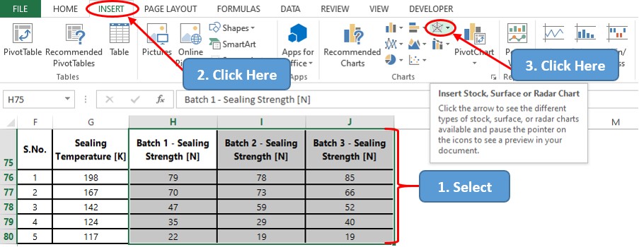
It is to be noted that the version of MS Office that has been installed on your PC shall determine whether the icon would contain multiple chart categories combined together as shown or given separately.
After clicking on the icon a drop-down list with a variety of chart types shall appear. We shall choose the 3D Surface Plot for this demonstration, but the process is the same if one wants to create a 3D Wireframe Surface Plot too.
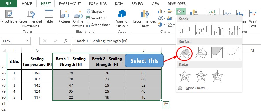
Once done, now a chart shall appear since we have already selected the data upon which it is to be created.

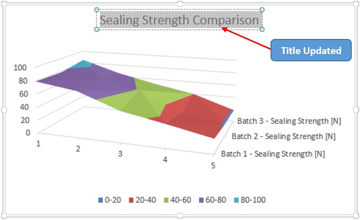
Though the chart appears instantly, it, however, has some shortcomings before it could be put into use elsewhere. One of those is the Chart Title which is filled with a default text & the other is the front horizontal axis which has also been filled with default values.
Also, it is to be noted that there are no axis titles in any of these axes which makes it a tad bit difficult to interpret which axis stands for what. So, we shall also include axis titles for each of the axes in the above chart.
Updating Chart Title
Double-click within the chart title, delete the default text & replace it with that of our choice as shown below.
Updating Horizontal Axis Values
Right-click anywhere within the chart and choose the Select Data option to make the Select Data Source pop-up appear.
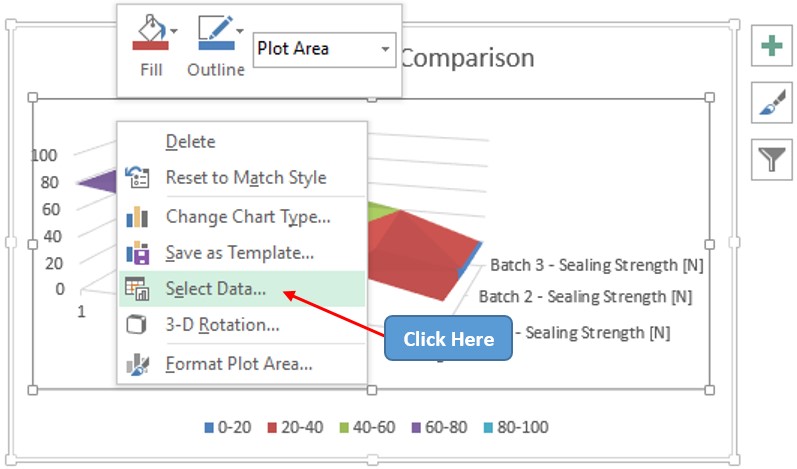
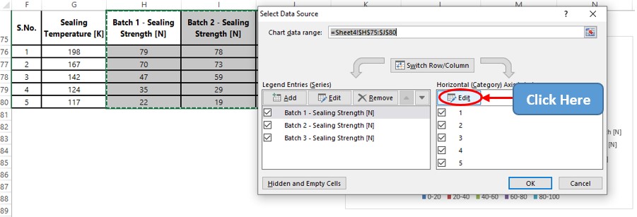
Once within the Select Data Source pop-up, select the Edit option under the Horizontal Axis Labels section to change the default values.
This leads us to the Axis Labels dialog box within which the data range containing the values to be displayed on the horizontal axis can be chosen.
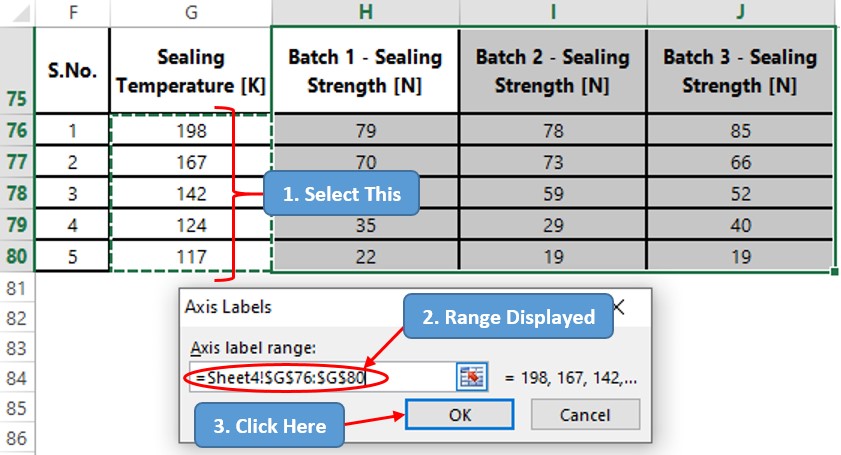
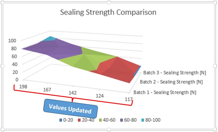
After clicking OK, we shall be directed back to the Select Data Source pop-up. Click OK again & now the chart updated with the values along the horizontal axis appears.
Including Axis Titles
Click on the ‘plus’ (+) sign at the top right corner of the chart as shown below & check the Axis Titles option to get the axis titles in place.
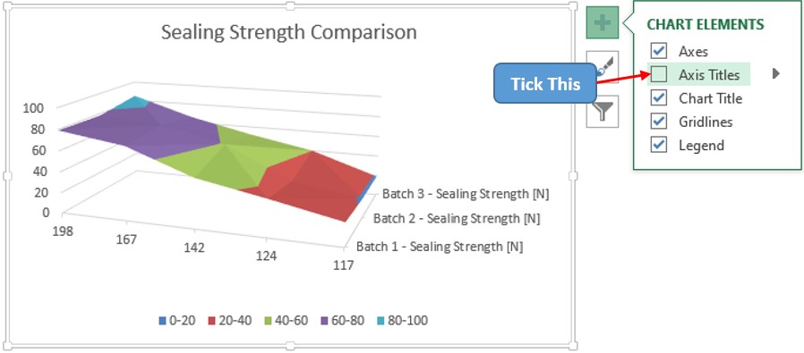
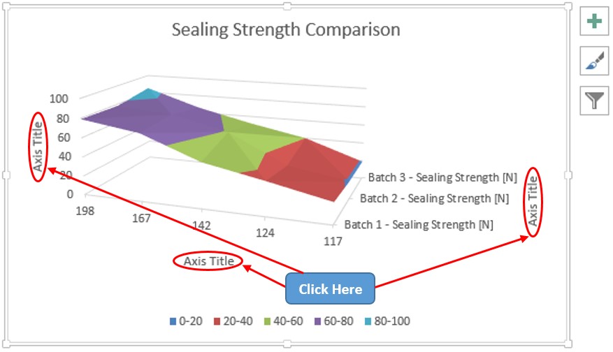
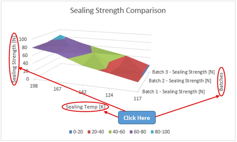
Double-click on each of these axis titles to update them similar to what was done earlier with the Chart Title.
Conclusion
Have a look at this article, in case you would like to know about creating 3D Area Charts in MS Excel. There are numerous equally interesting & informative articles in QuickExcel that serve to be a great asset to those who pursue their journey to excel in MS Excel. Adios.
