In recent days people are all rage about share markets. Not even a day goes by, without the words stocks, options, futures, and derivatives passing by one’s ears. Being the go-to data interpretation tool that Excel is, seems that it has also got to offer a handful of tricks for one to get accustomed to the visualization of the rather exhaustive stock market data.
This article would be focussing on the demonstration of the variants of Stock Plots using a month’s data from the company – Kadaisila Salpi! Before getting on with it, let us have a look at each of the variants in Stock Plots that MS Excel has got to offer.
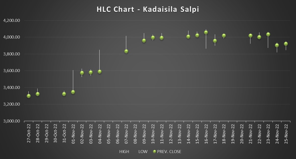
- High-Low-Close(HLC) Plot – The HLC plot would help one in visualizing the evolution of the highest, lowest & closing prices of the desired company stock for each set time point (hours/day/week/month/year) over a set timeline.
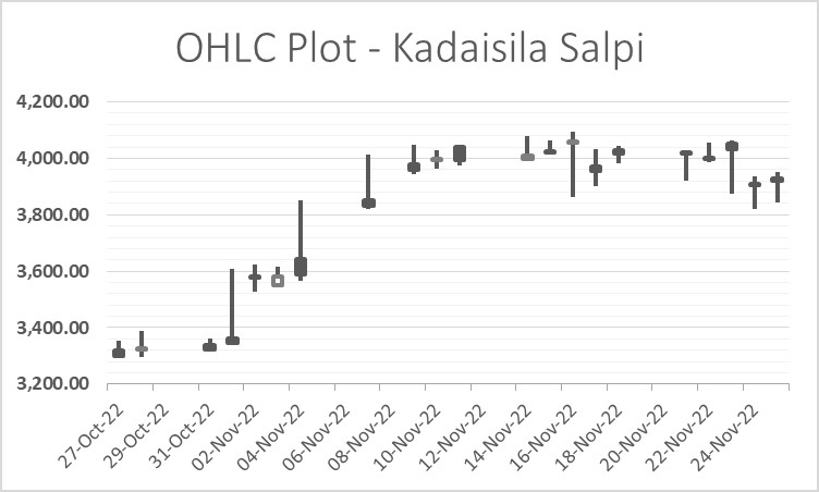
- Open-High-Low-Close(OHLC) Plot – The OHLC plot helps one in plotting the change in the opening, highest, lowest & closing prices of the desired company stock for each set time point (hours/day/week/month/year) over a set timeline.
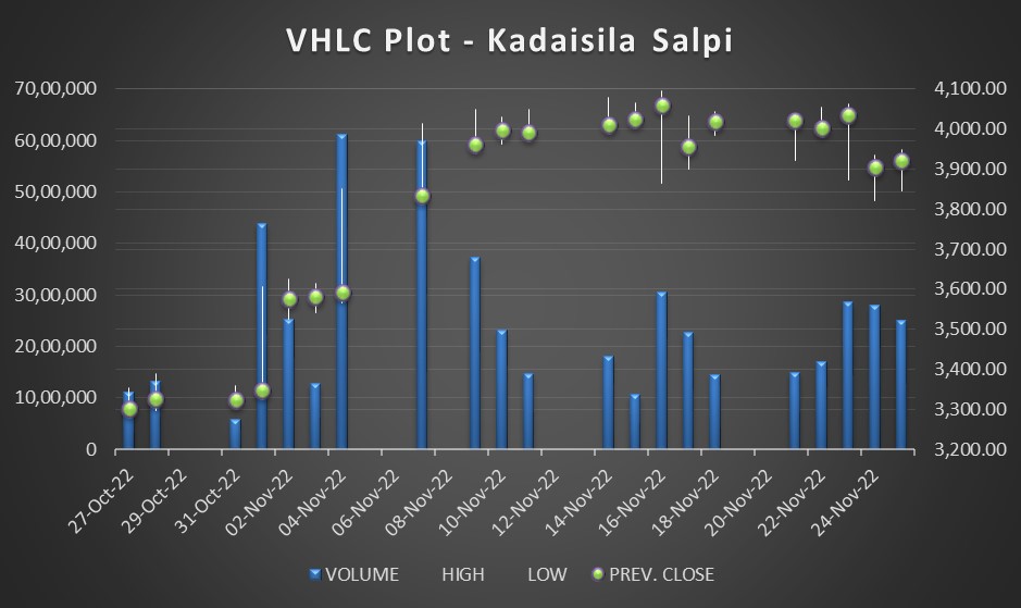
- Volume-High-Low-Close(VHLC) Plot – The VHLC plot puts into perspective the total number of shares traded at each set time point (hours/day/week/month/year) over a set timeline in addition to the offerings given by the HLC plot.

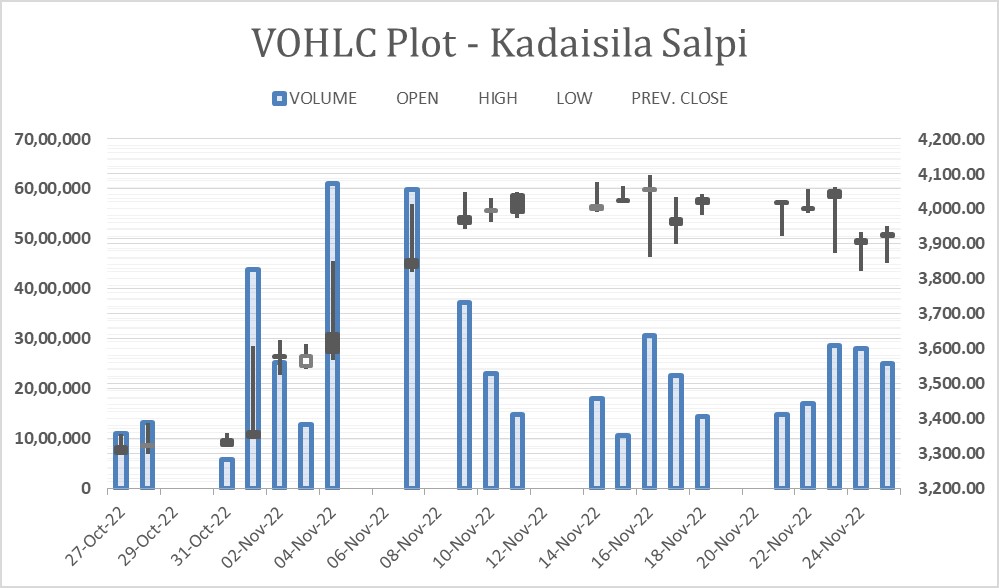
- Volume-Open-High-Low-Close(VOHLC) Plot – The VOHLC plot adds the transaction of numbers of shares traded over the entities plotted by an OHLC plot for each set time point (hours/day/week/month/year) over a set timeline.

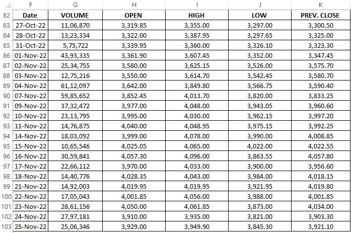
Following is the dataset of the performance of the company Kadaisila Salpi that will be used for creating the Stock Plots. It is imperative that each data column is arranged in the same sequence as given below for easier plotting of the data.
Creating an HLC Plot in Excel
Since the data will be plotted across a timeline, the Date column would be an obvious selection followed by the columns I, J & K as shown below.
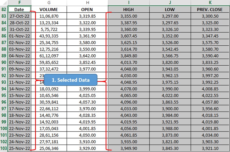
Once done, take your cursor to the Charts section within the Insert tab, where one can find the ‘Web’ icon as shown below. A note of caution is that this icon might differ with each version of MS Office, but a quick look around within the Charts section shall put the Stock Plots within one’s sight.
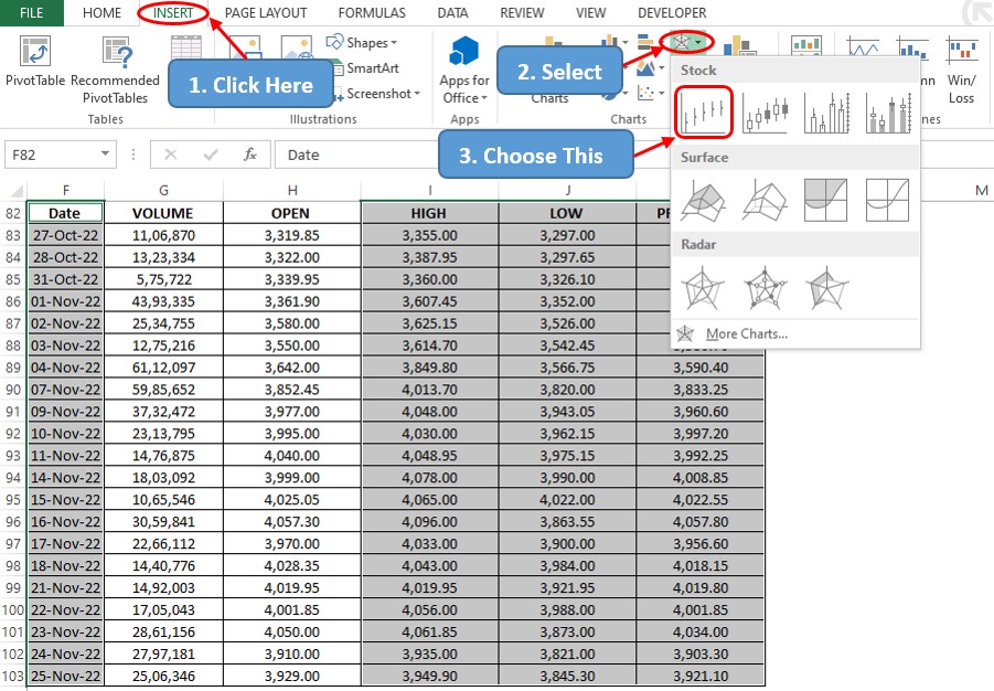
Click on the HLC plot icon as indicated above and a chart shall be created instantly with the data that has been selected. One can replace the default title that appears along by double-clicking within it & typing the desired title.

Creating an OHLC Plot in Excel
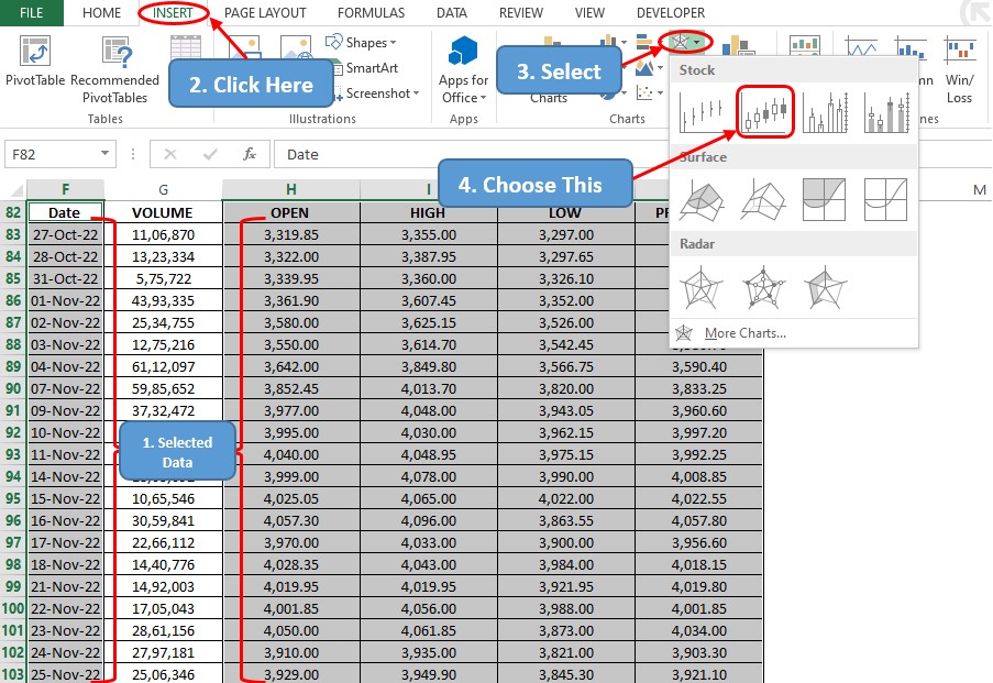
The same process can be repeated for creating an OHLC plot with the only addition that the ‘Opening’ prices listed under column H are also to be selected alongside.

Creating a VOHLC Plot in Excel
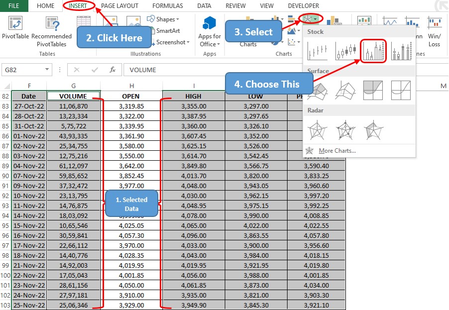
Now it’s time to add some quantity along with the price & since this is the VOHLC plot, one might select the entire tabulation of data available as shown below before selecting the corresponding icon within the Insert tab.
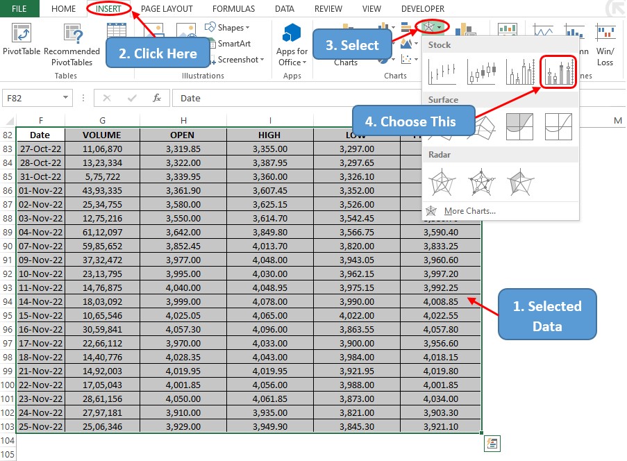
A click on the chart icon indicated above gets things done at once. One can edit the ‘Chart Title’ as stated earlier in this article.
Creating a VHLC Plot in Excel
One ought to remove one column from the selection of items done earlier for the VOHLC plot & probably you’ve guessed which – the ‘Opening’ price details. Repeat the same procedure and the chart shall be created within a blink of an eye.
Conclusion
Hope this article helped you understand how to create a stock plot in MS Excel & find your way around the different variants there are to choose from. Have a look at this article to know how to edit a chart area in MS Excel. There are numerous equally interesting & informative articles in QuickExcel that serve to be of great help for your path to mastering MS Excel. Until then, cheers!
