In these days filled with influencer marketing, there is one thing that everyone relies upon – sales conversion! What if we tell you that there seems to be a tool in Excel that can come in handy for you to visualize the data?
The one that churns in the first level leads conversion to the final sales conversion. It is spot on in identifying the ratio between each process sequence.
Since the data here gets narrowed down in each process, it looks similar to a funnel & thusly the name Funnel chart. That being told, this feature is only available in the versions of MS Excel on or after 2016.
Earlier it would be a tricky thing to do by turning the data into a stacked bar chart & then removing the base colored bars, followed by removing the spaces between the bars.
Creating Funnel Charts in Excel
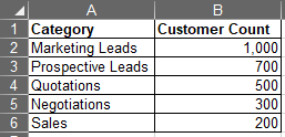
But now, with the arrival of this feature, MS Excel puts us out of our misery by helping us to get this chart done in a click. In this article, we shall explore how to create one with the following dataset.
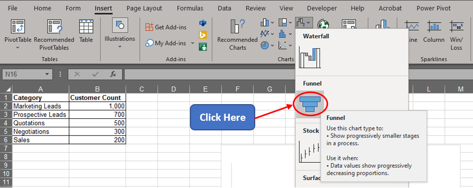
Firstly, get the cursor into the Insert tab & then into the Charts section as shown below. Within the Charts section, there shall be an icon for the Waterfall chart and that is where we shall be heading next.

Click on the chart icon, which shall take you to a drop-down list containing variants of charts under different categories. The one we are looking for now is the Funnel Chart. Once it is spotted click on that icon as shown below.
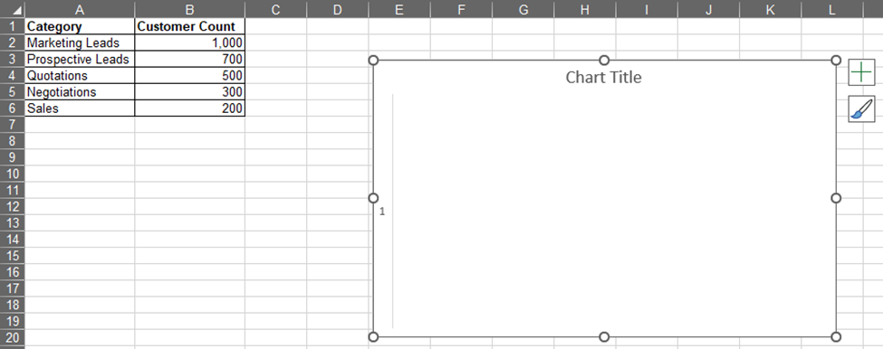
This shall make a blank chart area appear within the worksheet.
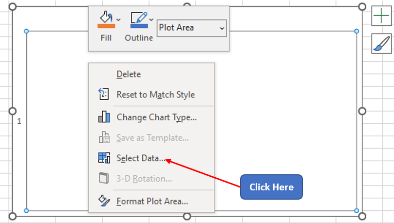
Take the cursor within the chart area & right-click anywhere within. This in turn makes a menu with a list of options appear and one shall choose the Select Data option from it.
Now the Select Data Source pop-up appears prompting to choose the required data for the chart.
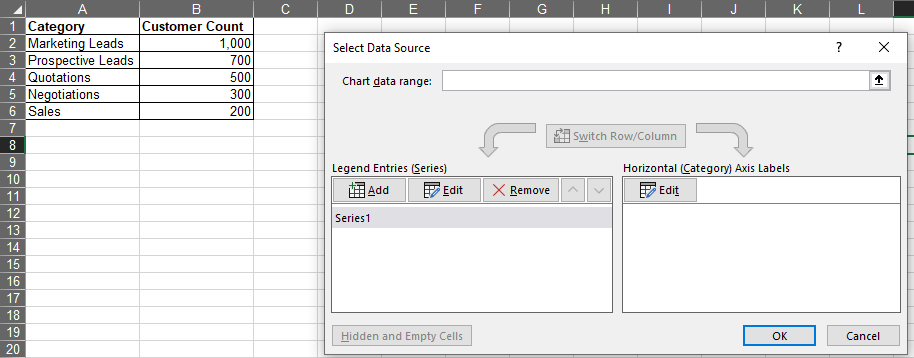
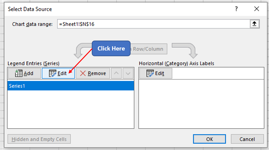
Click on Series 1 within the Legend Entries section of the pop-up and then click on the Edit option as shown below.
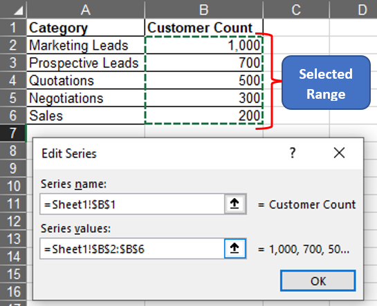
This shall take us to the Edit Series dialog box, where one can select the cell references for the Series Name and also select the cell range which contains the values for which the chart is to be created as shown below.
Once done, click OK at the bottom of the Edit Series dialog box, which shall take you back to the Select Data Source pop-up. On the other hand, the blank chart area now has a funnel chart with the values selected, however, there are no details telling what stage of the funnel denotes what.
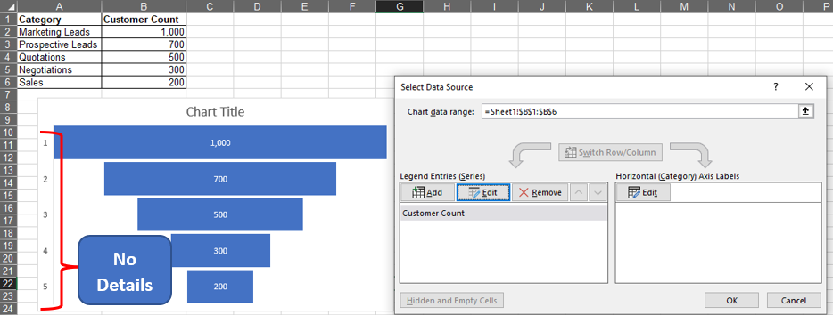
To rectify this, one shall select the Edit option under the Horizontal Axis Labels as shown below.
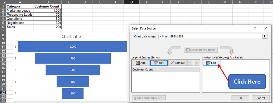
Now the Axis Labels dialog box appears & one can choose the entries under the column titled Category as follows.
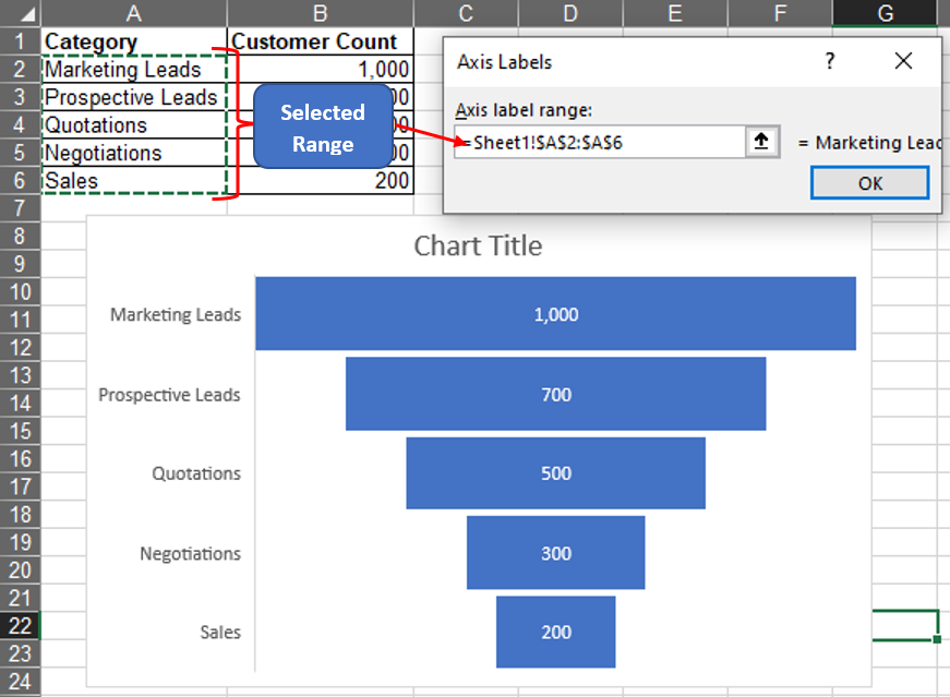
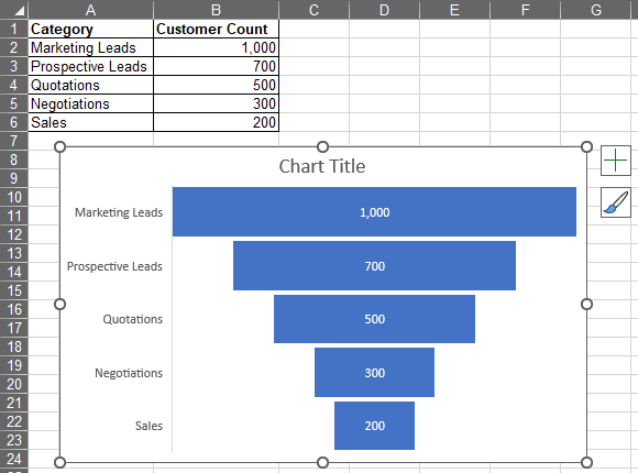
Now click OK & one shall be taken back to the Select Data Source pop-up within which OK is again to be clicked. The pop-up disappears & only the chart becomes visible.
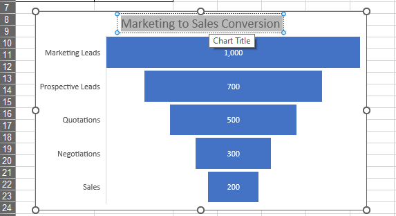
One can also edit the default title of this chart by double clicking within the ‘title box’ & replace the contents as shown below.
Conclusion
Hope this article helped you understand how to create a Funnel chart in MS Excel & has given you what you came looking for! Have a look at this article, to know how to create a Waterfall chart. There are numerous equally interesting & informative articles in QuickExcel that serve to be of great help for you to up your skills in MS Excel. Cheers!
