MS Excel not only has a number of formulae to get things done quickly but also is blessed with a wide range of visual data interpretation tools. One such feature is its ability to create charts. This article would deep dive into demonstrating one such chart with real-time examples for better understanding – the ‘Column Chart’.
Types of Column Charts in MS Excel
There are 3 categories in which the column charts are available in MS Excel and each of these categories is available both in 2D and 3D formats as well. A concise description of each of these column charts is given below,
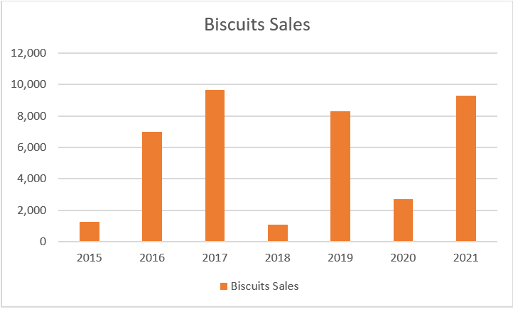
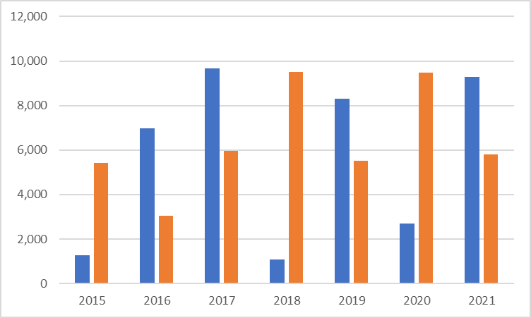
- Clustered Column Chart – This chart compares the values of entities (single or multiple) in columns across a common gauging which in most cases would be time. (Eg.) Sales of an item for the past few years.
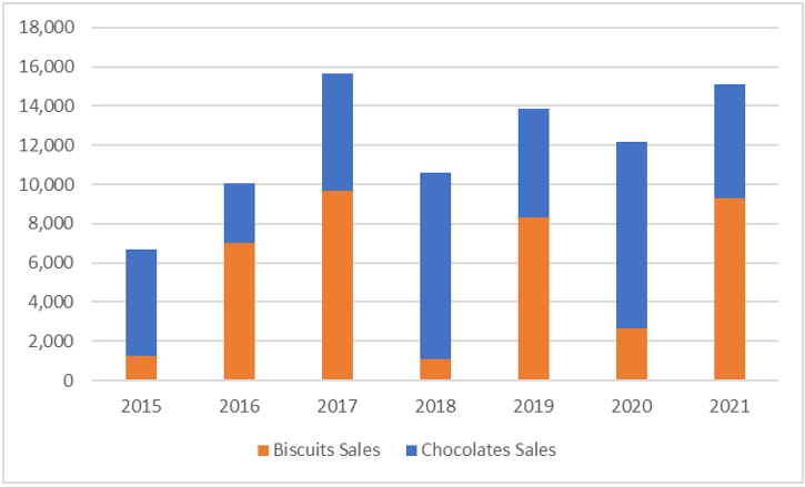
- Stacked Column Chart – This chart serves the purpose when one wants to compare multiple entities within the same column across a common gauging which in most cases would be time. (Eg.) Sales of 2 items depicted within the same column of total sales across the years.
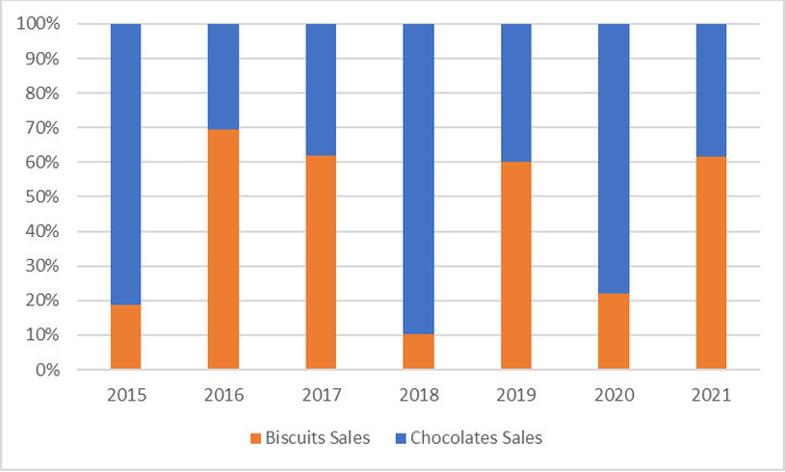
- 100% Stacked Column Chart – This type of chart is used when one wants to see what proportion of an entity’s contribution is towards the total figure achieved. Here each entity’s contribution is expressed in terms of percentages rather than absolute figures. (Eg.) Each total sales column is bifurcated into a percentage of sales of 2 items over a particular period.
Creating a Regular Column Chart
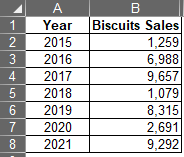
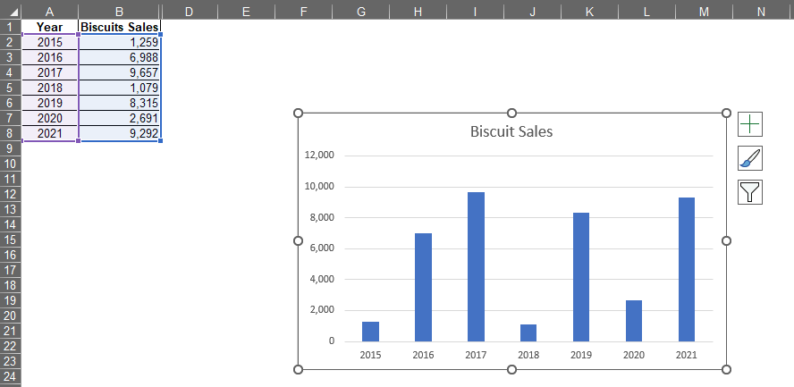
The following set of data will be used to create a single-column chart for comparing the sales performance of Biscuits across the years from 2015-2021.
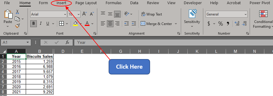
Now one shall hover the cursor over the Tabs section & click on the Insert tab as shown below.
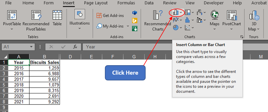
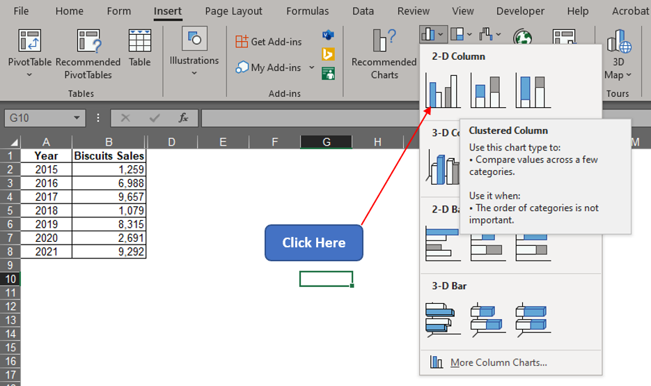
Once within the Insert tab, get into the Charts section & click on the Column Chart icon.
Once done, the following drop-down menu appears with a list of variants in column charts to choose from. Let us stick to the 2D chart with this example and within that let us select the clustered column chart.
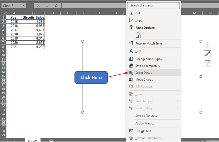
A blank chart area now appears! Right-click on that & choose the Select Data option.
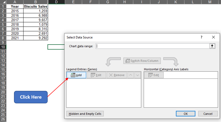
Now the Select Data Source pop-up appears. Click on the Add option.
Now the Edit Series dialog box appears. Click on the arrow icon within the Series values field to select the values under column B.
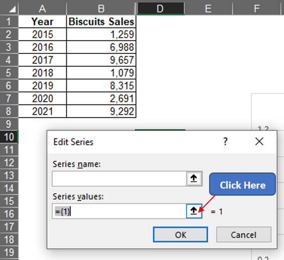
Now left click on B2 and drag till it reaches B8 to select all the entries with sales data of Biscuits under column B.
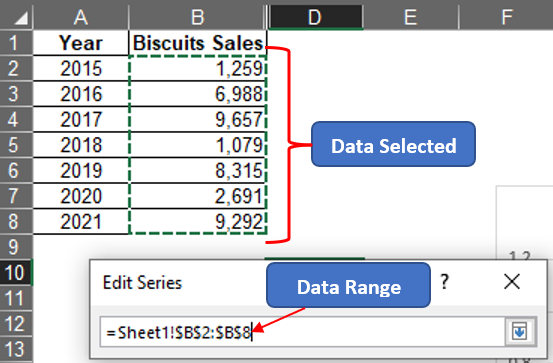
Hit ENTER & we are back to the Edit Series dialog box. One can type in the title one desires under the Series name field.
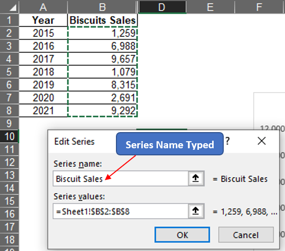
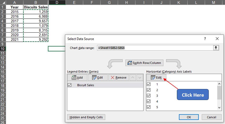
After typing the Series name, hitting ENTER & we are taken back to the Select Data Source pop-up. Click the Edit icon on the Horizontal Axis Labels section.
Now the Axis Labels pop-up appears. Follow the same steps as previously stated to select the Axis label range & select the values under the Year column.
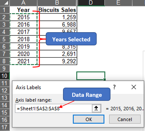
Hit ENTER & we are taken back to the Select Data Source pop-up. Hit ENTER again & we are taken back to the sheet which now has a chart created within.
Conclusion
To further edit how the chart appears, have a look at this article. There are numerous equally interesting & informative articles in QuickExcel that serve to be a great help to those who pursue their journey to excel in MS Excel. Hope this article helped you understand how to create a column chart in MS Excel & gave you what you came looking for! Cheers.
