What shall one do when asked to visualise a given set of data which has two independent variables and one dependent variable? This article explains how one could solve this with a Surface Plot using Excel.
But, the downside with a Surface Plot is that it plots the given dataset in the form of a 3D mesh across a plane, leaving one to play with the orientation of the chart to get a better view of the different sections of the plot. So, in order to get the entire plot right in front of one’s eyes, MS Excel has an alternate offering – the Contour Plot!
What this does is provide the top view of the same plot generated in the Surface Plot such that all its sections along with the corresponding variations are differentiated in a two-dimensional plane.
Similar to the Surface Plot, here too the dependent variable is plotted against the independent variables for one to find the optimum combination. We shall further dive deep into this article on creating a Contour Plot.
Types of Contour Plot
The Contour Plots can be sighted as two variants within MS Excel viz.
- Standard Contour Plot – The plot area can be seen filled with colours to differentiate the variation within the data plotted.
- Wireframe Contour Plot – The plot area is blank without any colour but only their boundaries are differentiated by colours to indicate the variation within the data plotted.
Creating a Contour Plot:
The following dataset contains the results of a Sealing Strength test which is dependent on the below variables.
- Sealing Temperature
- Batch Type

So, the Sealing Strength will be plotted in the two-dimensional plane of the Contour Plot against the independent variables – Sealing Temperature and Batch.
Select the test results data and look out for the Web icon under the Charts section within the Insert tab as shown below.
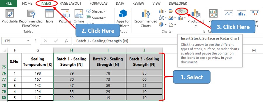
We all don’t live the same life, do we? The same goes for our PC too where we all work with different versions of MS Office which shall determine whether the icon would contain multiple chart categories combined together as shown or given separately.
Click the Web icon and a drop-down list with a variety of chart types shall appear. We shall choose the Contour Plot for this demonstration, but the process is the same if one wants to create a Wireframe Contour Plot too.
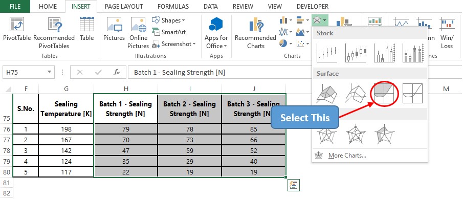
Immediately following this a chart shall appear with the plot of the selected data.

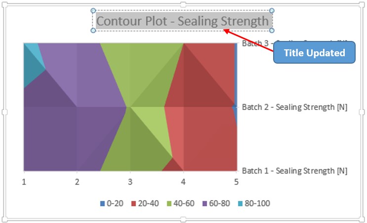
Upon a glance, a trained eye can spot a few shortcomings before this chart could make it to the presentations. The Chart Title section is filled with a default text & the horizontal axis is also filled with default values.
Also, there are no axis titles in any of these axes which makes it a tad bit difficult to interpret them. So, we shall change all these one by one!
Updating Chart Title
Double-click within the chart title, delete the default text & replace it with that of our choice as shown below.
Updating Horizontal Axis Values:
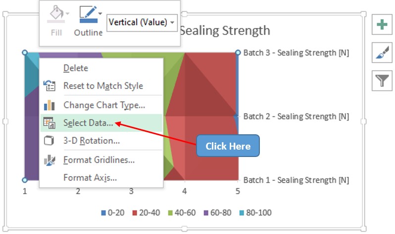
Bring the cursor within the chart area and right-click anywhere to make a list of options appear. Choose the Select Data option in that list as shown below.
Now the Select Data Source pop-up appears. Select the Edit option under the Horizontal Axis Labels section to change the default values.
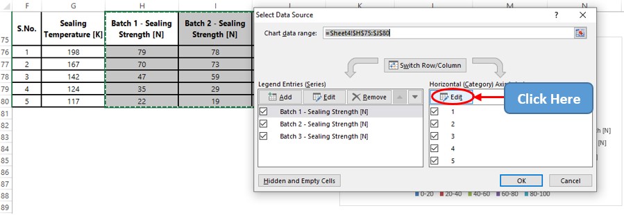
Once done, one shall now be taken to the Axis Labels dialogue box within which the data range of the values that are to be displayed on the horizontal axis are to be given as shown below.
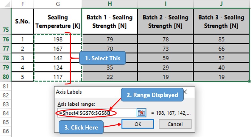
Clicking OK shall direct back to the Select Data Source pop-up, where one needs to click OK again to get the chart updated with the values along the horizontal axis.
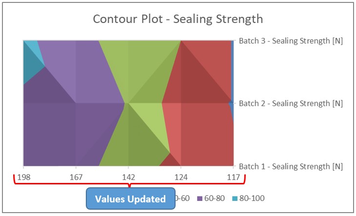
Including Axis Titles
Left-click anywhere within the chart & turn the focus towards the top right corner of the chart, a ‘plus’ (+) sign will be visible. Click on it & check the Axis Titles option to get the axis titles in place.
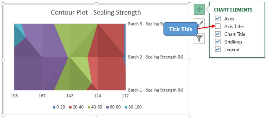
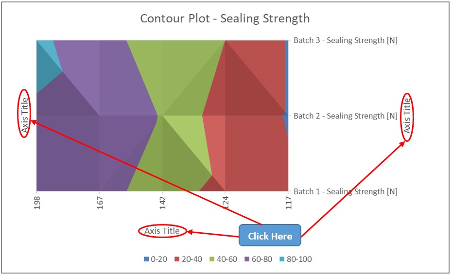
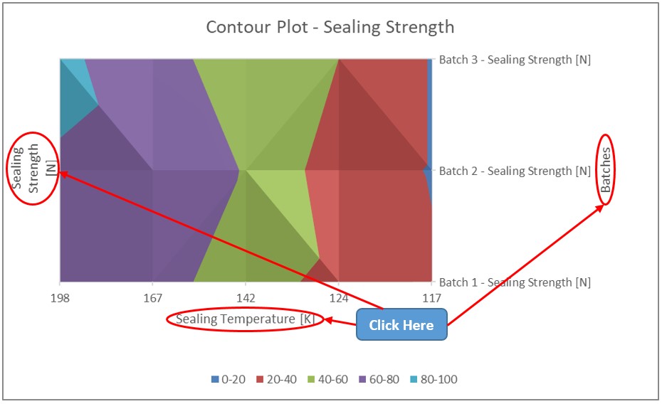
Double-click on each of these axis titles to update them similar to what was done earlier with the Chart Title.
Conclusion
There are numerous equally interesting & informative articles in QuickExcel that serve to be a great asset to those who pursue their journey to excel in MS Excel. Whilst you continue to enjoy those, hasta luego!
