There is a list of data of 2 products across the same time period and you want to compare how each product performed in each year side by side. Numbers take us as far as presenting the data for our needs, but comparing those just by looking at it is something that a vast majority of us ain’t good at. So, MS Excel is bestowed with just the tool you need to do this comparison – The Clustered Column Charts!
In this article, we shall elaborate on the procedure to create clustered column charts in MS Excel. We’ve also covered the steps for creating single-column charts.
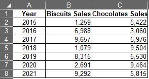
Following is the dataset that we shall use for demonstration throughout this article.
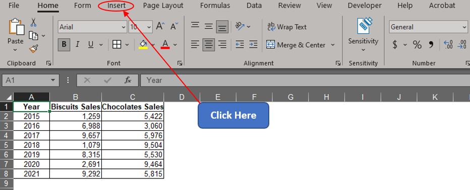
One shall get started by searching for the Insert tab among the list of available tabs. Hover the cursor over the Tabs section & click on the Insert tab as shown below.
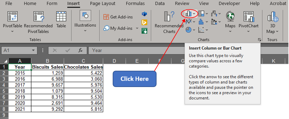
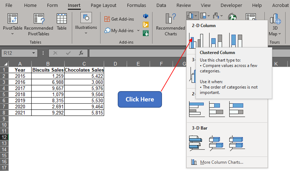
Once done, get into the Charts section & click on the Column Chart icon.
The following drop-down menu appears with a list of variants in column charts to choose from. Select the clustered column chart for comparing the sales of biscuits and chocolates over the years.
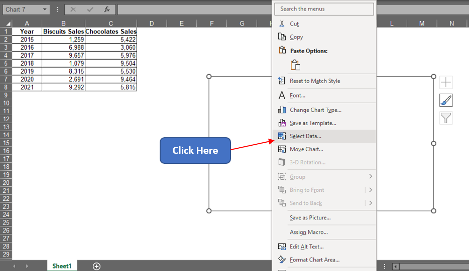
A blank chart area now appears! Right-click on that & choose the Select Data option as shown below.
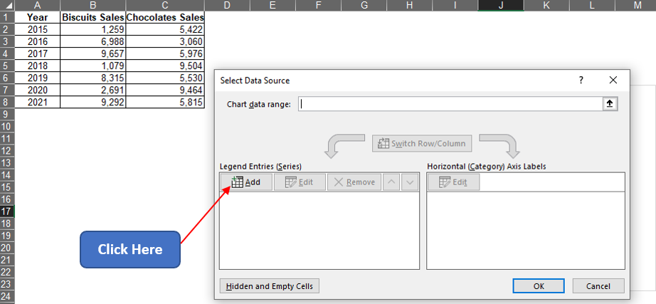
A Select Data Source pop-up shall appear now. Click on the Add option as indicated in the below image.
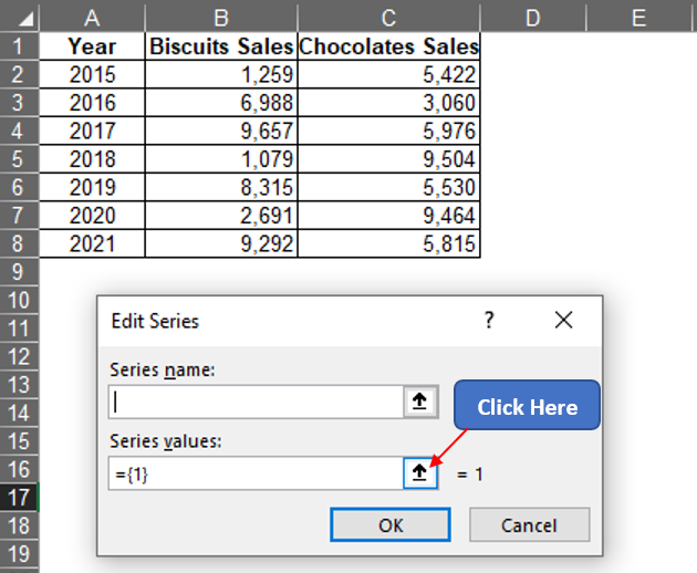
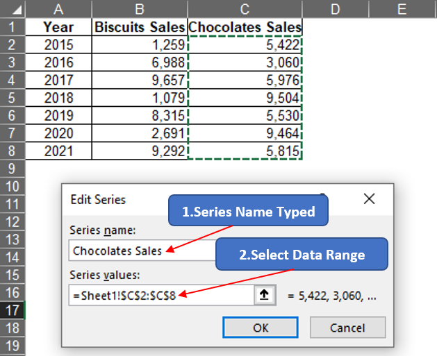
Now the Edit Series dialog box appears. Click on the arrow icon within the Series Values field to select the values under column B for the values of biscuits. Hit ENTER and again follow the same sequence to select the values under column C for the values of chocolates.
Now left click on B2 and drag till it reaches B8 to select all the entries with sales data of Biscuits under column B.
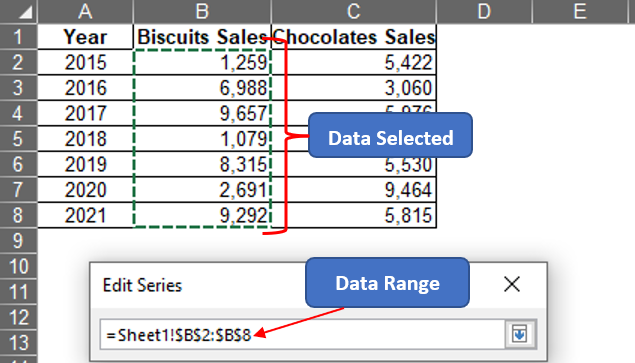
Hit ENTER & we are back to the Edit Series dialog box where one can type the required title under the Series name field as shown below.
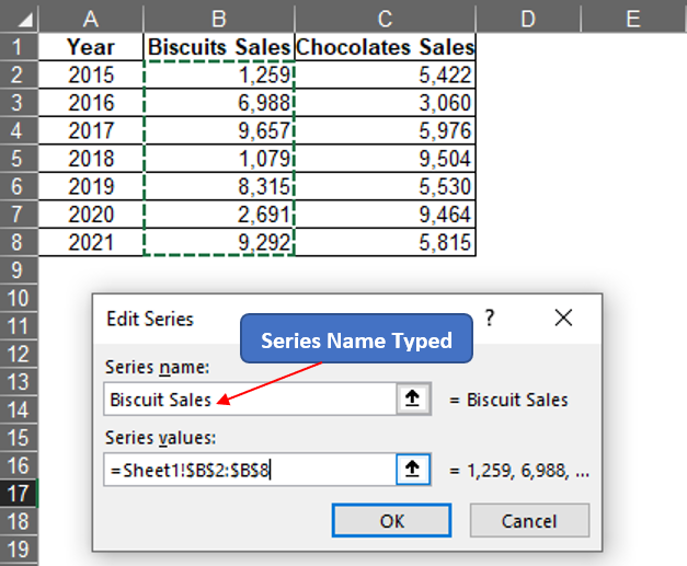
After typing the Series name, hitting ENTER & we are taken back to the Select Data Source pop-up. Click on the Add option again to include the values of Chocolates & then click OK after the values under column C are selected.
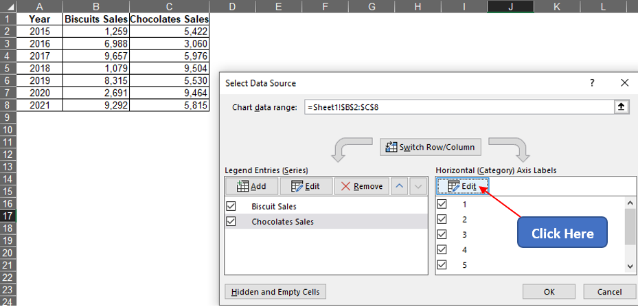
Now we are again back to the Select Data Source pop-up where we ought to click the Edit icon on the Horizontal Axis Labels section.
Now the Axis Labels pop-up appears. Follow the same steps as previously stated to select the data range & select the values under the Year column.
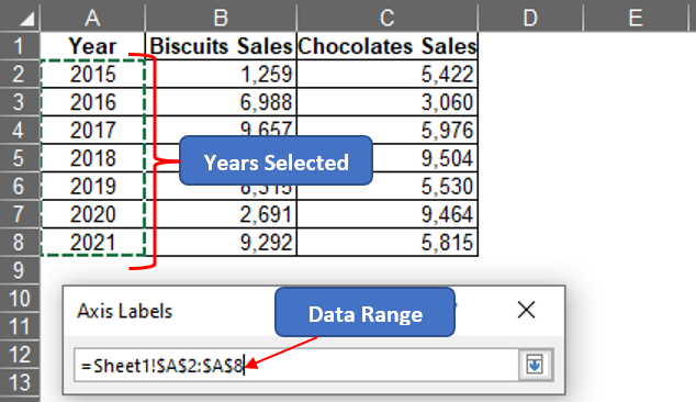
Hit ENTER & we are again taken back to the Select Data Source pop-up. Hit ENTER again & we are taken back to the sheet which now has the clustered chart created within.
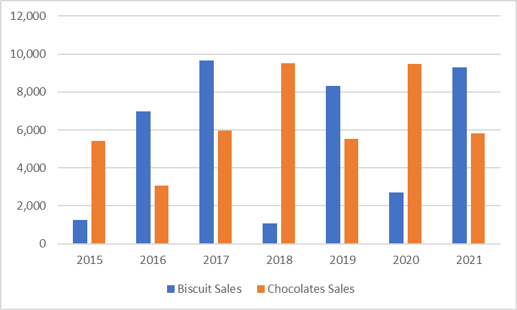
The above chart easily compares the sales of biscuits vs chocolates side-by-side for each year so that one can right away spot the evolution of the annual sales of both products over the period.
Nevertheless, this same technique can also be used to create Stacked Columns & 100% Stacked Column Charts with the only difference being the corresponding option being selected in the Column Chart drop-down menu.
Conclusion
To further edit how the chart appears, have a look at this article. There are numerous equally interesting & informative articles in QuickExcel that serve to be a great help to those who pursue their journey to excel in MS Excel. Hope this article helped you understand how to create a clustered column chart in MS Excel & has given you what you came looking for! Cheers.
