When there is a need to compare the performance of the same entity across two different time periods along the horizontal axis, who you gonna call within Excel? The Clustered Bar Chart!
Similar to those charts where the performance of a particular player or a team is compared across 2 different seasons or tournaments, clustered bar charts would help you to do just that in a jiffy. In this article, we shall elaborate on the procedure to create clustered bar charts in MS Excel.
Have a look at this article in case you want to know about creating clustered column charts.
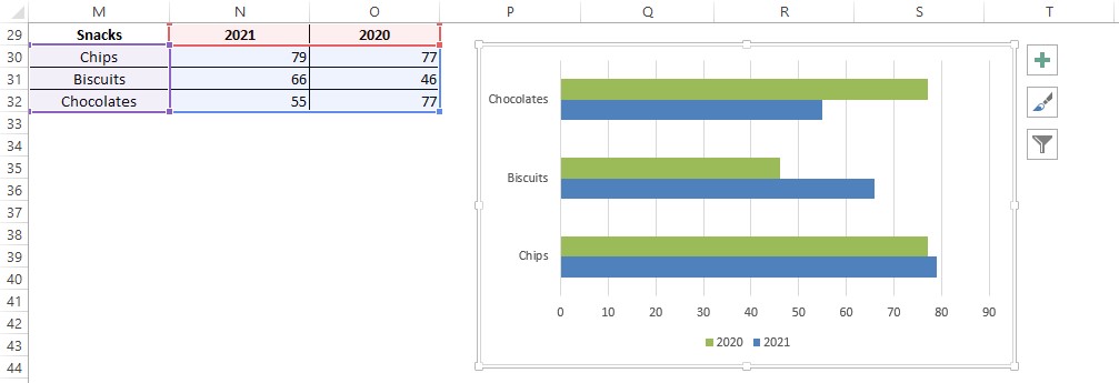
Following is the dataset that we shall use for demonstration throughout this article and we would be comparing the votes obtained by each snack side-by-side for the years 2021 & 2020.

Also read: [Step-by-step] How to Create a Bar Chart in Excel?
Steps to Create Clustered Bar Charts in Excel
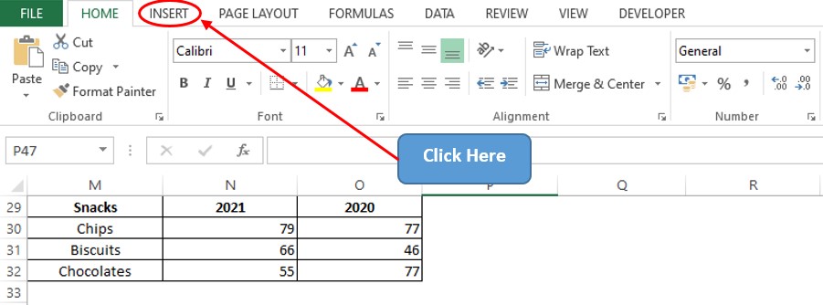
Let’s get started by searching for the Insert tab among the list of available tabs. Move that cursor & it is high time that one clicks on the Insert tab as shown below.
Search for the Charts section & click on the Bar Chart icon as indicated in the below image.
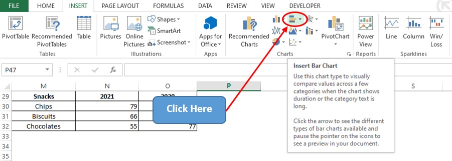
A drop-down menu shall now appear with the different varieties of bar charts inbuilt into MS Excel. Select the clustered bar chart for comparing the data of votes across both years.

The following sequence of steps remains the same if one wants to create a two-dimensional stacked bar chart or a 100% stacked Bar chart with the only difference being the selection of the respective chart icon in the above step.
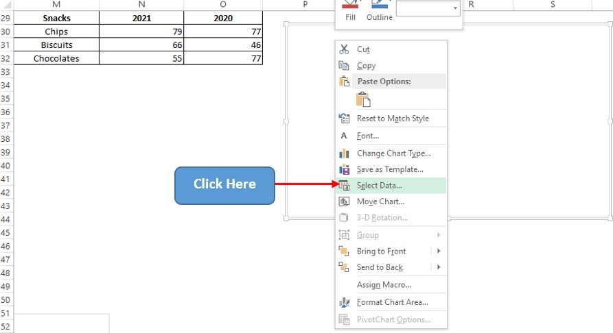
A blank chart area shall now appear in front of you. Right-click on that & choose the Select Data option as shown below.
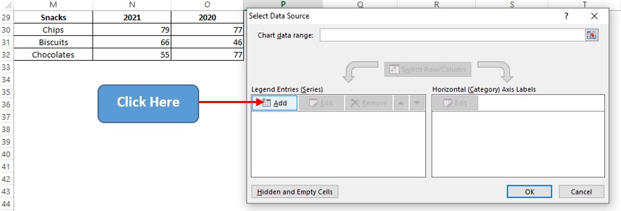
Now a pop-up titled Select Data Source shall appear. Within that click on the Add option as indicated in the below image.
This leads us to the Edit Series dialog box. Click on the arrow icon within the Series Values field & select the values under column N for the votes of 2021. Hit ENTER and again follow the same sequence to select the values under column O for the votes of 2020.
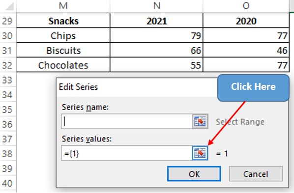
Now left click on N30 and drag till it reaches N32 to select all the votes of 2021 under column N.
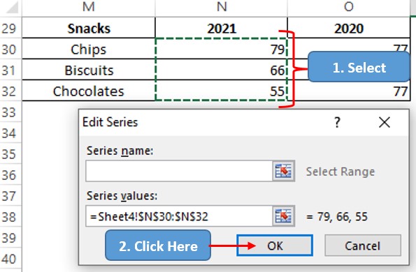
Hit ENTER & we are taken back to the Edit Series dialog box where one can type the required title or select the cell which contains the title under the Series name field as shown below.
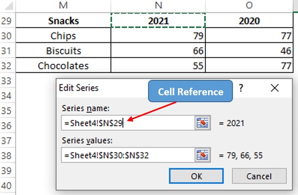
After typing the Series name, hit ENTER & we are back to the Select Data Source pop-up. Click on the Add option again to include the votes of 2020 & then click OK after the values under column O are selected.
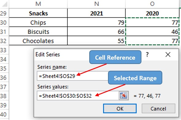
Now we are again back to the Select Data Source pop-up. After the back & forth commute, now our attention needs to be shifted to the Horizontal Axis Labels section.
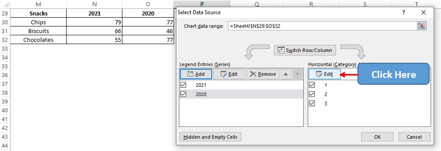
Now the Axis Labels pop-up appears. Follow the same steps as previously stated to select the snacks listed under column M.
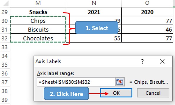
Hit ENTER & we are taken back to the Select Data Source pop-up. It ends here this time – Finally, phew! Hit ENTER again & we are taken back to the sheet which now has the clustered bar chart created within.
Conclusion
Hope this article helped you understand how to create a clustered bar chart in MS Excel. There are numerous equally interesting & informative articles in QuickExcel for those who pursue their journey to excel in MS Excel. Ciao.
