This tutorial is a detailed guide to creating stunning 3D maps in Microsoft Excel. With 3D maps, you can make your geographical data reports more attractive and informative, thanks to Excel’s smarter updates.
By the end of this tutorial, you would have learned to create and customize 3D maps based on real databases from scratch.
Let’s get cracking!
Steps to create 3D maps in Excel
Let’s get started with creating and customizing 3D maps in Excel.
The first step is to create tabular geographical data to create a 3D map for it.
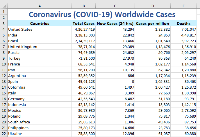
Here is a sample dataset of the all-time and 24-hour worldwide COVID-19 cases.
Getting started: Enabling or adding the Power Map add-in
Let’s quickly create a 3D map of this dataset.
Before you begin, you need to enable a COM add-in to let to apply 3D maps to data. You can easily insert the add-in if you use Excel 2016 or a higher version of Excel.
If you’re on Excel 2013, then download and install the Power Map Add-in for your Excel version from the web.
Here’s how you can enable the Power Map add-in in Excel if you’re on a higher version, or have already installed the add-in.
- Go to the File tab.
- Click on Options.
- Click on Add-ins on the left.
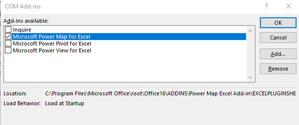
- Choose COM add-ins from the Manage at the bottom.
- Click Go.
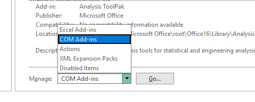
- Enable Microsoft Power Map for Excel.
- Click OK.
You’re all good to go now!
Inserting the 3D map
Make sure you are connected to the internet because Excel uses Bing Maps to create 3D maps.
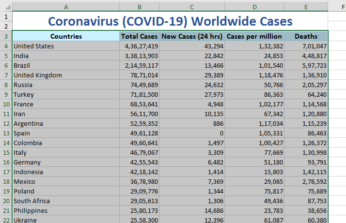
- Select the entire database with the headers.
- Go to the Insert tab.
- Click on 3D Map.
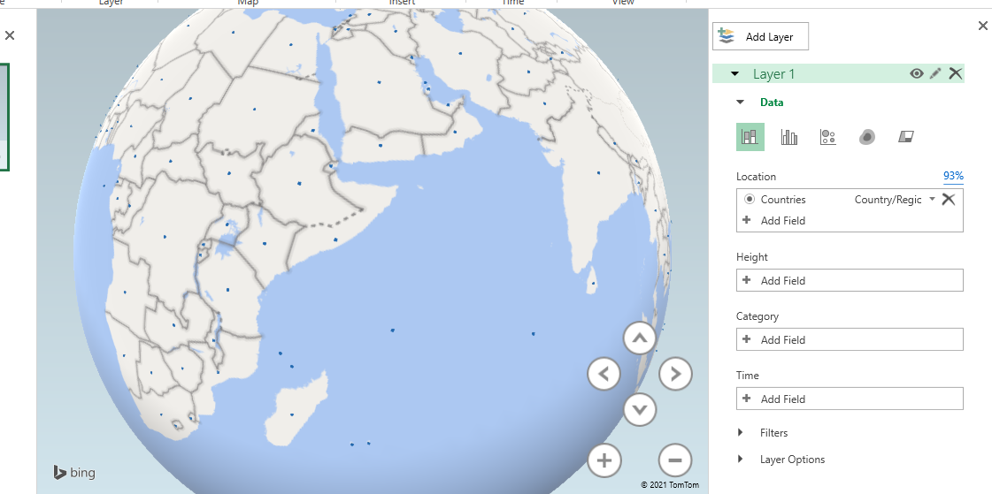
- A new window opens showing the locations on a map.
Handling data on the 3D map
The windowpane on the far right shows some options to display the desired fields on the map.
You can add a field from your table to the different layers available.
- Change the visualization to region.
- For instance, we add the New Cases field in the Value layer.
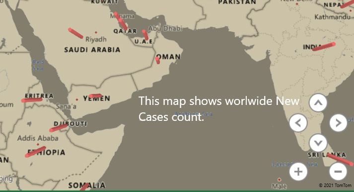
- The map is now highlighting the countries that had new coronavirus cases within 24 hours.
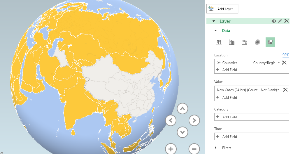
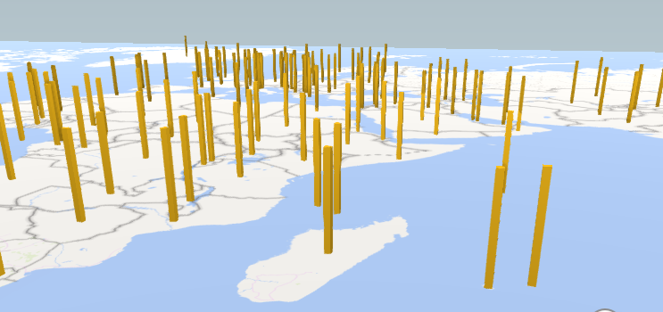
You can choose different data visualization options like Heat Map, Region, Bubble, Clustered Column, and Stacked Column.
- Click on the Flat Map button on the ribbon above to get a flat view of the map.
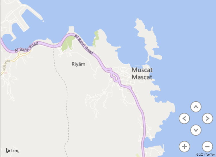
- Click on Find Location on the top ribbon to find a custom location on the map.
- Type the name of a location.
- For example, “Muscat”.
- Click Find.
- Click on Map Labels to view area names on the map.
If you have made any changes to the source data table in Excel, you can click Refresh Data on the top ribbon to update that information on your map.
Customizing the 3D map
To change the look of your 3D map.
- Click on the Themes button on the ribbon.
- Choose a theme for your map from the available options.
To hide or unhide the legends on the chart.
- Click on Legends in the top ribbon to view or unhide the legends on the map.
- Click on the legends box on the map and press Delete on your keyboard to hide the legend.
To insert a text box on the map.
- Click on the Text box button on the ribbon.
- Add a custom title to the text.
- Add a custom description.
- Apply the text customization options like color, font size, font style, text box fill color, and font family.
- Click Create when you’re done.
If you wish to edit the text in the box, double-click on the box to be able to edit the text again.
Conclusion
This tutorial was a detailed guide to creating beautiful 3D maps in Microsoft Excel. Stay tuned for more fun topics like this only at QuickExcel!
Reference: Dummies.
