Avatar is a great movie – A James Cameroon masterpiece! But what made it even better was the IMAX 3D experience. How about bringing the same magic to data visualization in Excel too? Yep! That’s very much doable & we are about to explore one such feature in this article – 3D Column Charts.
We shall demonstrate the procedure to create 3D Column Charts (both clustered & separated) in MS Excel. Have a look at this article if you want to know about creating clustered column charts in 2D.
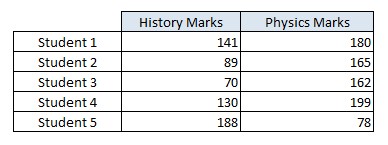
Following is the dataset containing the marks obtained by a group of students in History & Physics which shall be used for demonstration throughout this article.
Steps for Creating 3D Column Charts in Excel
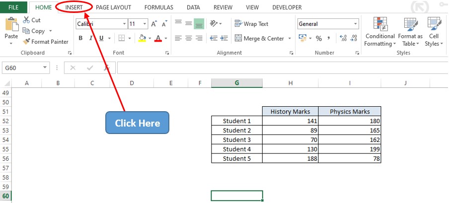
Let us get started by searching for the Insert tab among the list of available tabs. Hover the cursor over the Tabs section & click on the Insert tab as shown below.
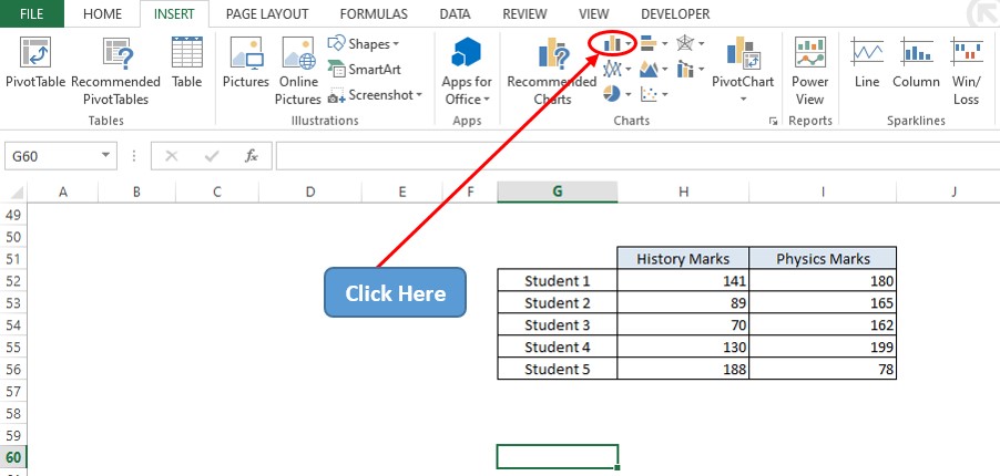
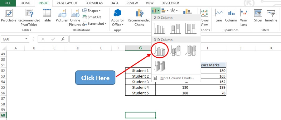
Once within the Insert tab, get into the Charts section & click on the Column Chart icon as shown below.
Once done, there shall be a drop-down menu appearing as indicated in the below image with a list of variants in column charts to choose from. Select the 3D clustered column chart for comparing the marks of the students.
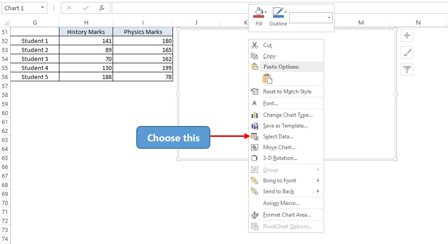
A blank chart area now appears! Right-click on that & choose the Select Data option as shown below.
A Select Data Source pop-up shall now appear. Click on the Add option as indicated in the below image.

Now a dialog box titled Edit Series shall appear. Click on the arrow icon within the Series Values field to select all the values under column H for History marks. Now left click on H52 and drag till it reaches H56.
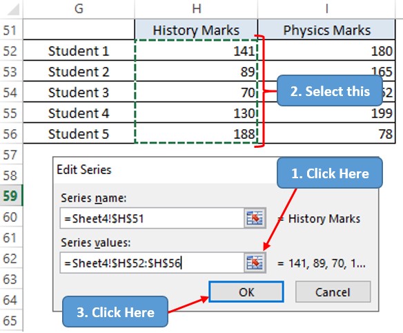
Hit ENTER and again follow the same sequence to select all the values under column I for Physics marks.
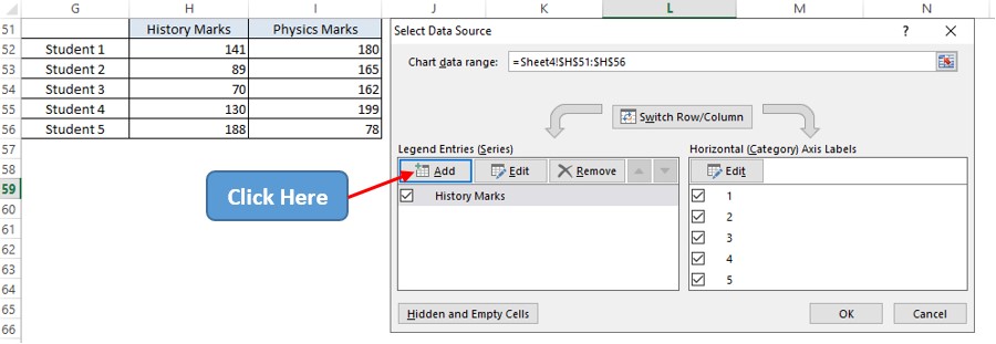
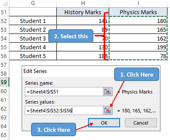
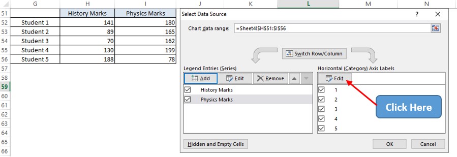
Hit ENTER & we are again taken back to the Select Data Source pop-up. Click the Edit icon on the Horizontal Axis Labels section.
Now the Axis Labels pop-up appears. Follow the same steps as previously stated to select the data range & select the student’s list.
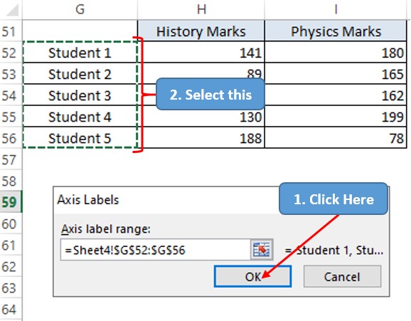
Hit ENTER & we are again taken back to the Select Data Source pop-up. Hit ENTER again & we are taken back to the sheet which now has a 3D clustered chart created!
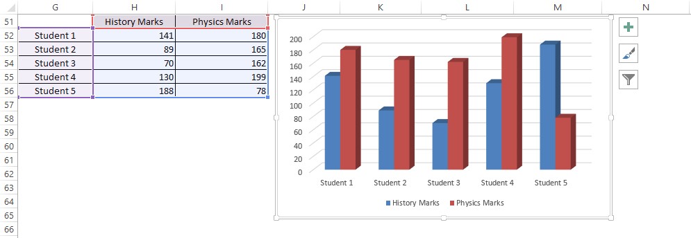
The above chart easily compares the marks obtained by the students in both subjects side-by-side. The same approach is to be adopted if one has to create a 3D Stacked Column or 3D 100% Stacked Column chart.
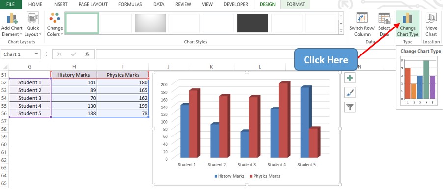
However, if one wants to separate these columns into two different rows that can also be done! Click anywhere in the chart area & only then the Chart Tools section shall appear. Choose the Design tab within the Chart Tools & click on the Change Chart Type icon as shown below.
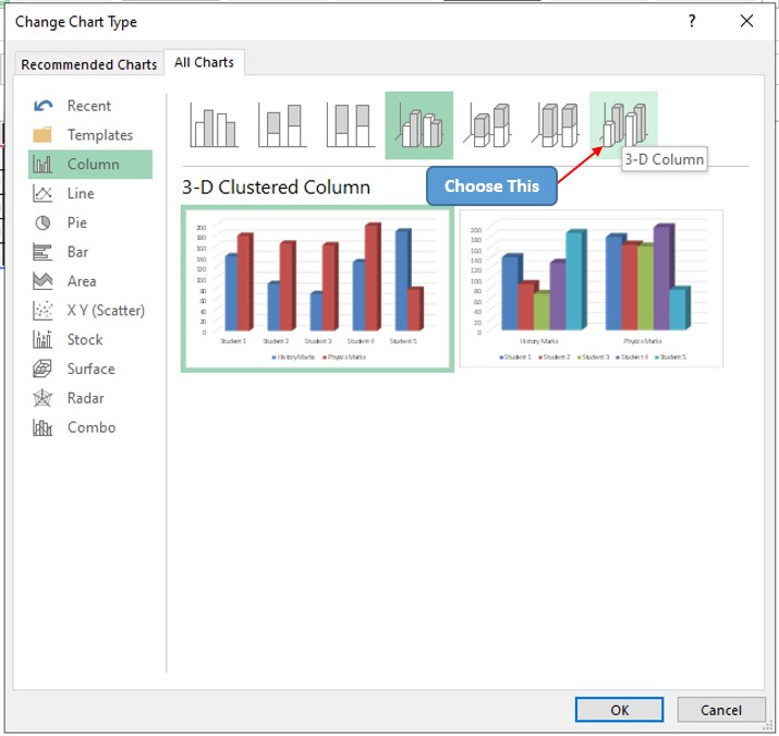
The Change Chart Type dialog box appears & click on the option as shown below.
Now the chart recommendations appear & one can choose between the 2 choices on whether one wants to separate the columns by the subjects or whether one wants to separate the columns by the students along the Z axis.
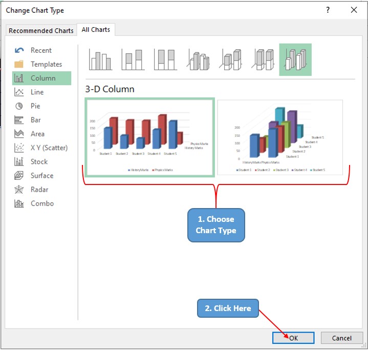
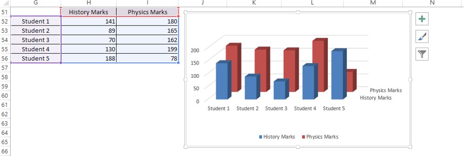
After clicking OK, the corresponding chart shall appear.
Conclusion
To further edit how the chart appears, have a look at this article. There are numerous equally interesting & informative articles in QuickExcel that serve to be of great help to those who pursue their journey to excel in MS Excel. Hope this article helped you understand how to create a 3D Clustered Column Chart in MS Excel & has given you what you came looking for! Ciao.
