Amongst the wide range of data interpretation tools available in Excel, the newest addition to its inventory is the Waterfall Chart and this time it is about handling finances. It is not a common thing to come across a visual interpretation of financial statements these days and MS Excel is said to have taken a step to fill this gap back in 2016.
Yes! Only MS Office versions on or after 2016 will be having this charting option. So, for those of you handling financial data using older versions of MS Office, day in & day out, it is high time to opt for an update. Rather than becoming too technical with the stream of finance, the creation of this chart shall be demonstrated in this article using a monthly budget of an individual.
Also read: How to Create Column Charts in Excel?
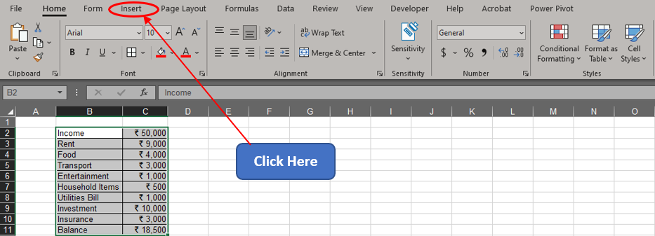
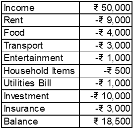
Consider this article as QuickExcel’s dedication toward the rising number of personal finance write-ups. Following is the dataset that we shall use for demonstration throughout this article.

In order to get started with creating a Waterfall Chart, one shall search for the Insert tab among the list of available tabs. Hover the cursor over the Tabs section & click on the Insert tab as shown below.
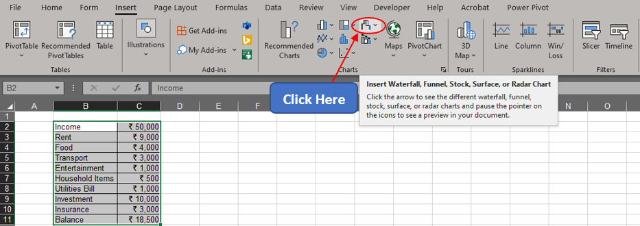
Once within the Insert tab, get into the Charts section & click on the Waterfall Chart icon.
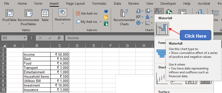
A drop-down menu shall now appear with a list of charts to choose from. Select the waterfall chart for plotting the income & expenses in the given dataset. One can also see a concise description appearing when the cursor hovers over the corresponding icon as shown below.
A chart now appears plotting the values within the selected range. But something doesn’t quite add up here!
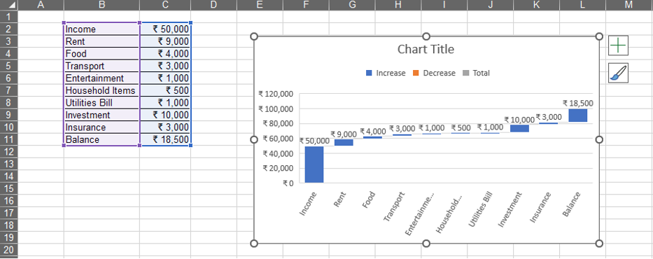
Having a glance at the legend, one can tell that all the entries given in the charts are taken as increases, whereas all the items except for Income & Balance are expenses. So, to convey that to MS Excel, one ought to include a negation within all the values except for Income & Balance as shown below.
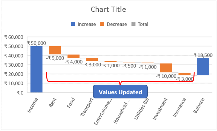
Now values updated in the dataset instantly reflect in the chart too by the appearance of the orange bars within the plot area indicating the expenses.
Still, one could see that there is no bar with the colour that indicates Total in the legend. The values under the ‘income’ & ‘balance’ can be categorized under Total since these are the amount that remains in the hand of the individual at the start & end of the month respectively. So, to change that left click on the blue bar for income. This selects all the data bars.
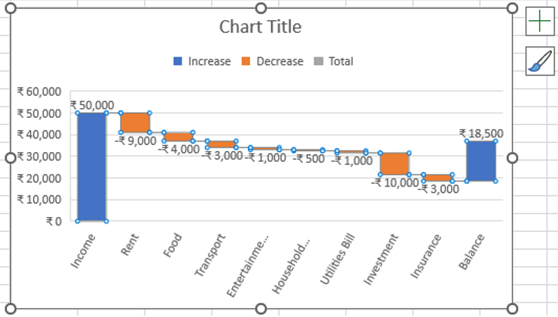
Now click again on the income bar, so that only that & nothing else get selected as shown below.
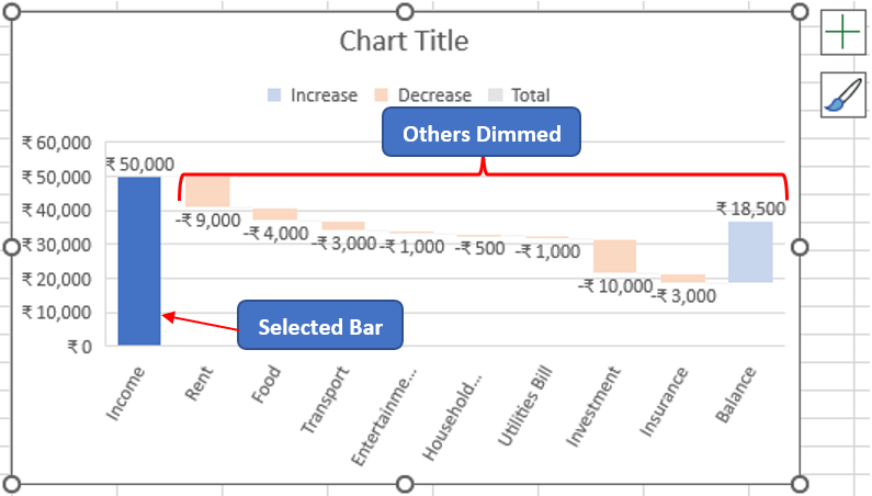
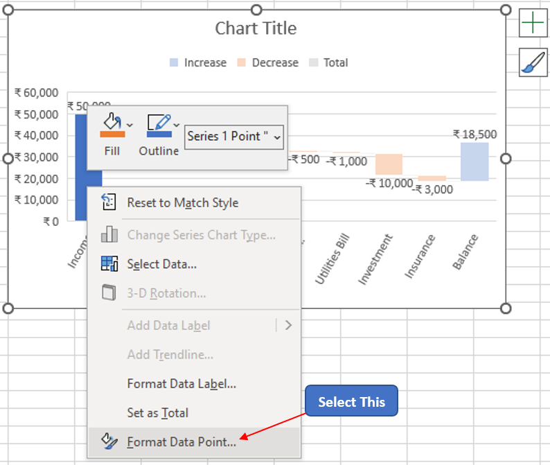
It is time that one right-clicks to choose the Format Data Point option from the menu that appears as shown below.
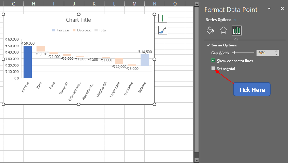
Once done, a panel shall appear on the right of the worksheet. Tick the Set as total option as indicated below.
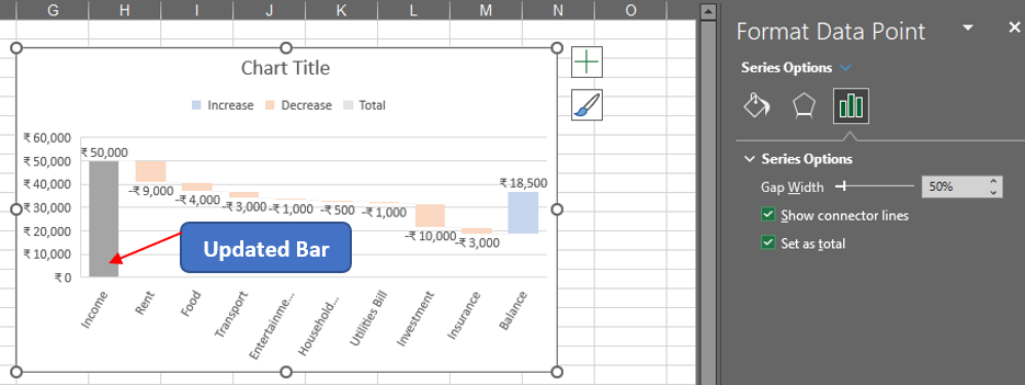
Once done the colour of the ‘income’ bar immediately gets updated from blue to grey as shown below.
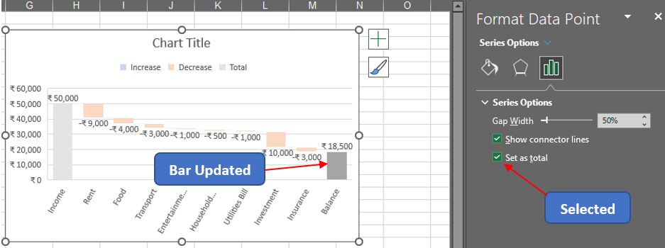
The same sequence is to be repeated for the ‘balance’ bar too, to change it into a Total.
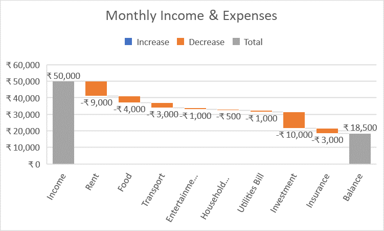
The Chart Title can also be changed by double-clicking it & replacing the default title with the desired one. So, now we have a waterfall chart plotting one’s monthly income & expenses.
Conclusion
Hope this article helped you understand how to create a waterfall chart in MS Excel & has given you what you came looking for! Have a look at this article to know how to create a Contour Plot in MS Excel. There are numerous equally interesting & informative articles in QuickExcel that serve to be of great help for your path to mastering MS Excel. Until then, cheers!
