This tutorial is a detailed step-by-step guide to creating a gauge or speedometer chart in Microsoft Excel. A gauge chart can be used to indicate employee performances.
A gauge chart looks like a half doughnut chart with a needle in the center. The needle adjusts based on the value of the chart. Gauge charts can be used to depict low to high-performance metrics in an area for a person.
Let’s learn to make a gauge chart in Excel today.
Steps to create a gauge or speedometer chart in Excel
Here are the steps to create gauge or speedometer charts in Microsoft Excel.
We will create the speedometer using a Doughnut chart and a Pie chart in Excel.
The first step is to create a tabular structure of the speedometer that corresponds to the chart. You have to specify the start, low, medium, high, and endpoints in the table.
Here is the tabular structure of the speedometer.
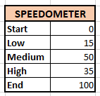
We have set the start and endpoints as 0 and 100. You can set any desired figures for the low, medium, and high points.
The next step is to insert a Doughnut chart for the table we just created.
- Go to the Insert tab.
- Click on the pie chart icon.
- Click on the Doughnut chart. A doughnut chart will be automatically created for you but it is recommended to restructure the chart manually.
- In the Chart Design tab, click on Select Data.
- Click on the existing entry on the left side.
- Click on the Edit button.
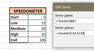
- In the series name, click on the table title named SPEEDOMETER.
- In the series value, select only the figures from the table.
- Click OK.
- Click OK to exit the window.
Now, it’s time to display only half the doughnut chart so that it resembles a speedometer. Follow the steps below.
- Click on a series of doughnut charts.
- Right-click on it.
- Click Format Data Series.
- Set the Angle of the first slice at 270° to bring the values at the top and center.
- Adjust the doughnut hole size as you like.
- Now, double-click on the blue series of the chart.
- Click on the paint bucket icon and click on Fill.
- choose No Fill.
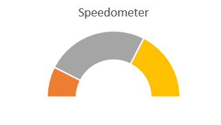
Your speedometer should look like this now.
Now, let’s customize the speedometer in Excel.
- Double-click on the first series and apply bright red color to it.
- Double-click on the second series and apply yellow color to it.
- Double-click on the third series and apply green color to it.
- You can apply any color or style you like to your speedometer.
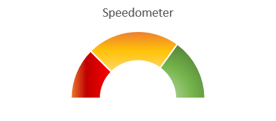
We have tweaked the values a little bit for the appropriate distribution of the series.
Now that we have finished making the speedometer, the next step is to create the needle of the meter.
So, to achieve this, we need to create the tabular structure of the pointer first. You have to specify the value, pointer size, and end values of the pointer.
The end value is the difference between the sum of the total values of the speedometer and the sum of the value and pointer size of the needle.
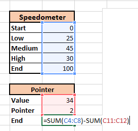
- In adjacent cell to End, type =SUM(
- Select the values from the speedometer table.
- Close the bracket.
- Put a minus sign (-).
- Type SUM(
- Select the two values from the pointer table.
- Hit ENTER.

Now, that the table is ready, it’s time to insert a pie chart over the doughnut chart. Follow the steps below.
- Right-click on the chart.
- Click Select Data.
- Click Add.
- In the series name, click on the title of the table named Pointer.
- In the series values, select the values of the pointer table.
- Click OK.
- Click OK again.
Now, change the chart type to Pie chart.
- Click on the external doughnut chart.
- Go to the Chart Design tab.
- Click Change Chart Type.
- Open the dropdown list for the Pointer chart.
- Select the first pie chart from the list.
- Click OK.

Let’s modify the chart to convert it into a needle.
- Double-click on the grey series of the pie chart.
- Click on the paint bucket icon in the Format Data Series pane.
- Under Fill, click on No Fill.
- Repeat the same for the blue series of the chart.
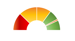
Follow the further steps to customize the needle.
- Right-click on the Needle or the pie chart.
- Click Format Data Series.
- Set the Angle of the first slice to 270°.
- You can change its color by clicking on the paint bucket icon.
- You can check the pointer’s functionality by changing the value in the Pointer table.
- Now, increase the size of the chart and delete the legends on it.
- Right-click on the white chart area.
- Click on the paint bucket.
- Under Fill, click choose a color.
Let us add a data callout on the needle.
- Right-click on the needle.
- Pull right on Add data labels.
- Click on Add Data Callouts.

- Double-click on all other data callouts other than the needle and press Delete on your keyboard.
- Double-click on the needle callout.
- In the formula bar, type = and click on the value figure in the pointer table.
- Hit ENTER.
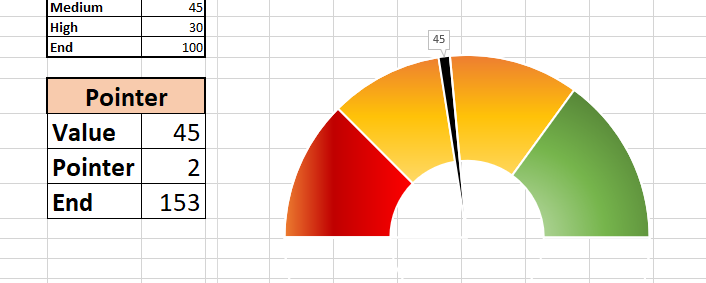
If you want to edit the text in the callout, double-click on it and modify it in the Home tab.
The speedometer is successfully ready!
Conclusion
This tutorial was a detailed step-by-step guide to creating a gauge or speedometer chart in Microsoft Excel. Stay tuned for more fascinating tutorials like this only at QuickExcel!
