A box and whisker plot, often known as a box plot, is a graph that displays a five-number data summary. This sort of graph is useful for displaying statistical data which includes test results or grades, new processes or changes before and after, or other numerical data analogies, which require a better presentable data form.
Steps To Create Box And Whisker Plot In Excel
This all begins with the data you provide, just like it’s done in any other sort of graphical data representation in Microsoft Excel.
In Excel, select the workbook and sheet that contains your data set. After that, to make the box and whisker plot, follow the step-by-step instructions given below.
- Select your data values for which you wish to plot the Box and Whisker graph. Select by dragging the left mouse click to select the data or click on the upper left cell of your data, while pressing down the shift key, and then press the bottom-right cell,
- Now select the ‘Insert‘ option from the above option/home bar.
- Choose ‘box and whisker plot‘ from the insert statistical chart menu in the Ribbon’s Chart Section.
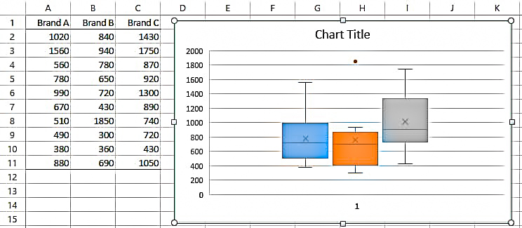
In your spreadsheet, your new box and whisker plot will appear as shown below.

Double-Check The Data In Your Box Plot
Excel will plot the data with the exact values for you. But, if you want to double-check the data or just require it for yourself, Microsoft Excels’ built-in features can help you out.
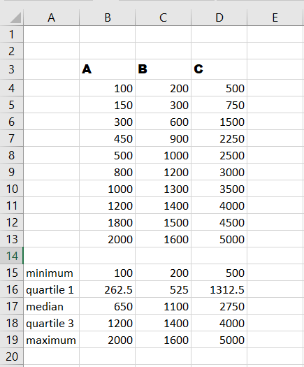
Return to your data collection and use the steps given below to calculate the minimum, first quartile, median, third quartile, and maximum values.

Calculate Minimum, Median, And Maximum
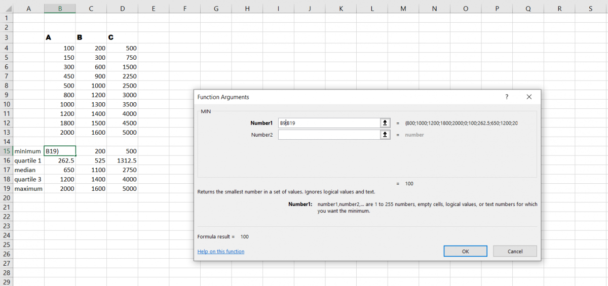
- Begin by selecting the cell where you’d like the initial function to be performed. Let’s start with the bare minimum.
- Select formulas from the drop-down menu.
- From the Ribbon, select More Functions and hover your mouse to Statistical.
- Swipe down the list in the pop-out box to MIN and click on it.
- Whenever the function displays in the cell, you have the option of dragging over the data set or entering the cell labels on the Function Arguments box that opens by hitting OK.
Simply repeat the process for the Median and Maximum by selecting MEDIAN and MAX from the list of all functions.

Quartile Function
- Select the cell in which you want the first quartile to appear.
- Select formulas from the drop-down menu.
- From the Ribbon, select More Function and hover your mouse over statistical.
- Select EXC from the list by Scrolling down.
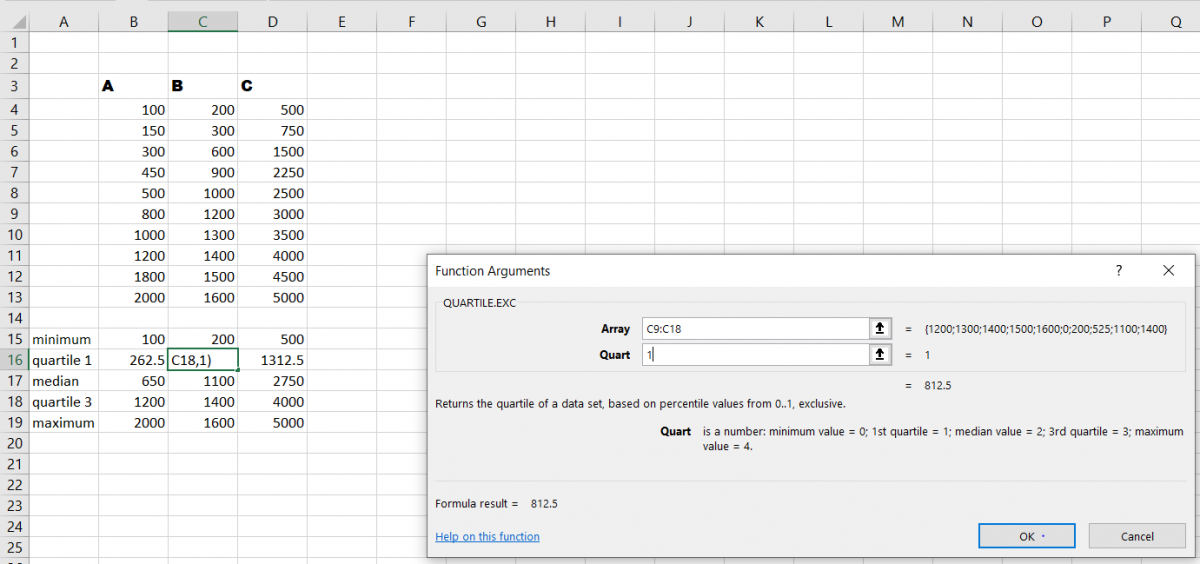
- The function arguments will display whenever the function shows up in the cell. As with MIN, either choose the required data set or type it into the Array Box in the arguments window.
- Then in the arguments window, in the Quartile field, put the quartile number. This will be number one for the first quartile in this situation.
- Click the OK button.
You’ll use the identical steps as before to insert the function again for the third quartile, although in the Quart box, type 3.

Conclusion
That’s It! You, can now easily plot a Box and Whisker graph in Excel for your data and make it look more presentable and easier to interpret.
We hope you learned and enjoyed this lesson and we’ll be back soon with another awesome Excel tutorial!
