This article describes how to create the best fit graph for Microsoft Excel. The best-fitting straight line is the straight line used to show the trend pattern in the scatter plot. If you don’t know how to create this type of rule manually, you need to use a complex expression. Fortunately, Excel makes it easy to find accurate trend lines by doing some basic calculations.
With newer versions of software such as Excel 2019, the process of adding optimal rules to your graph is very straightforward. This process requires you to first create the graph and then add and adjust the rules to properly analyze the data. This will create the best line.
Steps to add line of best fit in Excel
- Open the Excel document where you want to add the best rule.
- Make sure the workbook already has data. Mark the data you want to analyze with the best line.
- We need to Create a graph with the selected data.
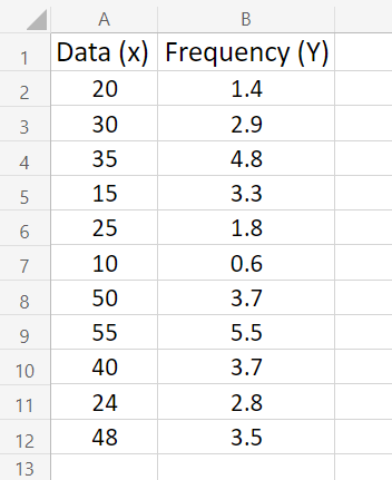
- Go to the Insert tab using the Ribbon interface. Choose the Insert Scatter (X, Y) or Bubble Chart icon in the Charts window, as shown in the figure below.
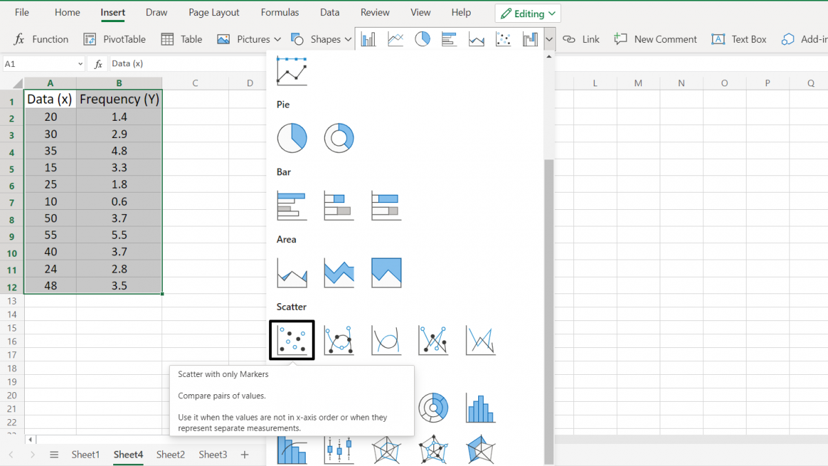
- After clicking or selecting on the ‘Scatter with only Markers’ we are presented with a chart as a pop-up window where our data is scattered in a graph with Y and X axis representing 2nd column (frequency, in our example) and 1st column respectively.
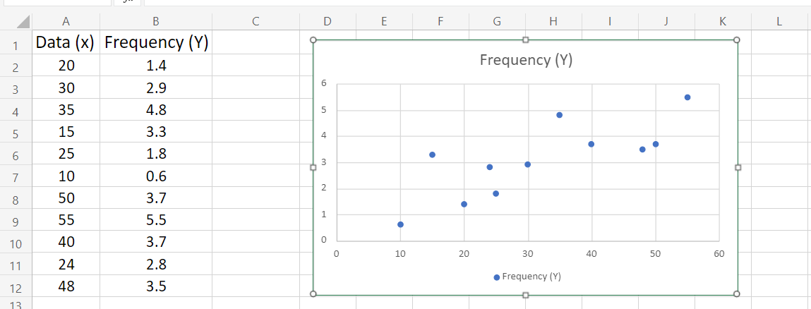
- Right-click on any of the data points (on the chart) once the chart has been added into your worksheet and select Format option to open a context menu in right window pane.
- From the context menu, choose the Add Trendline option. (seen at the end of the menu)

- Upon that right side of the window, you should be seeing a pane labeled Format Trendline open (drop-down after adding trendline).
- Look for the Options tab and then choose Linear from the drop-down menu.
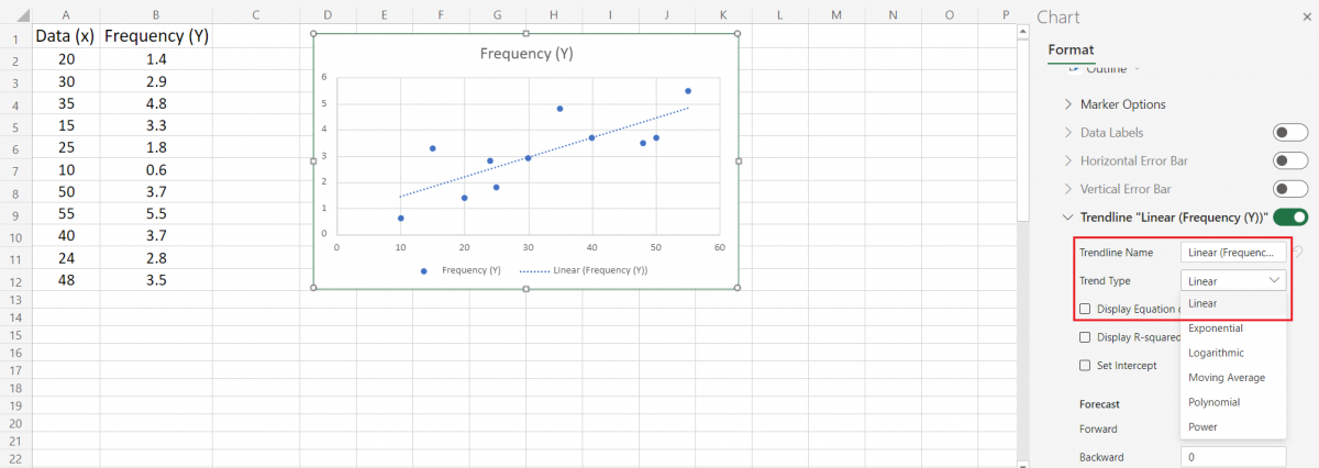
- Make sure the checkbox of Display Equation on Chart is enabled at the bottom of the Options section. The arithmetic calculations that were utilized to produce the best fit line are displayed now. (Optional)
- Move to the Fill & Line and Effects tabs in the Format window to modify how the line of best fit looks on the chart. You may completely modify the appearance of the line, making it stand out from the rest of your chart (here, color changed to black)

- Quit the format window by pressing close ‘X’ at the top and now you have your line of best fit put into the chart, you must be able to easily calculate and visualize.
Modify the design and colors of your chart using the Design tab once it has been selected. You may build custom charts that are formatted exactly as you want them. Merge this with the best fit line modification tools to make your charts really unique.
Add a line of best fit in Excel 2010 and before
The procedure differs somewhat from previous Excel versions, such as Excel 2010 and before.
But nothing to worry about, the instructions below will explain the process of creating this chart line.
- Open the Excel document to which the best fit line will be added. Check to see whether the worksheet already has data in it.
- With the line of best fit, highlight the data you wish to examine. A chart will be created using the selected data.
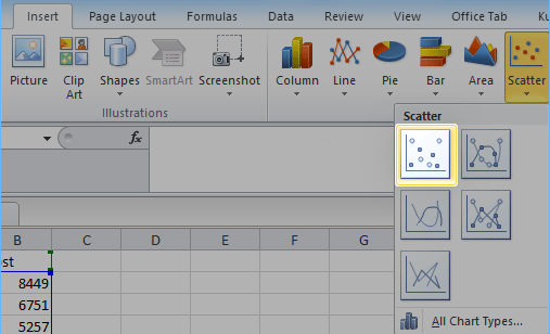
- Toggle over to the Insert tab. In the charts category, choose Scatter, and then the first scatter chart on the list. (See illustration below.)
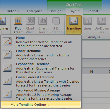
- Switch to the Layout tab in the Chart Tools section after selecting the newly generated chart. Expand the Trendline section and select More Trendline Options from the drop-down menu.
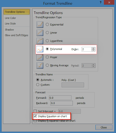
5. On the Format Trendline window, go to the Trend/Regression Category section and pick Polynomial. After that, make sure the checkbox next to Display Equation on Chart is checked.
- Check your chart after clicking the Close button. The best-fit line should now be displayed.
Conclusion
That’s It for the tutorial. Here was a complete guide on how you can how to add a line of best fit in Excel in a newer version of excel as well as in the older. Hope you have learned well and are ready to implement in your worksheet.
